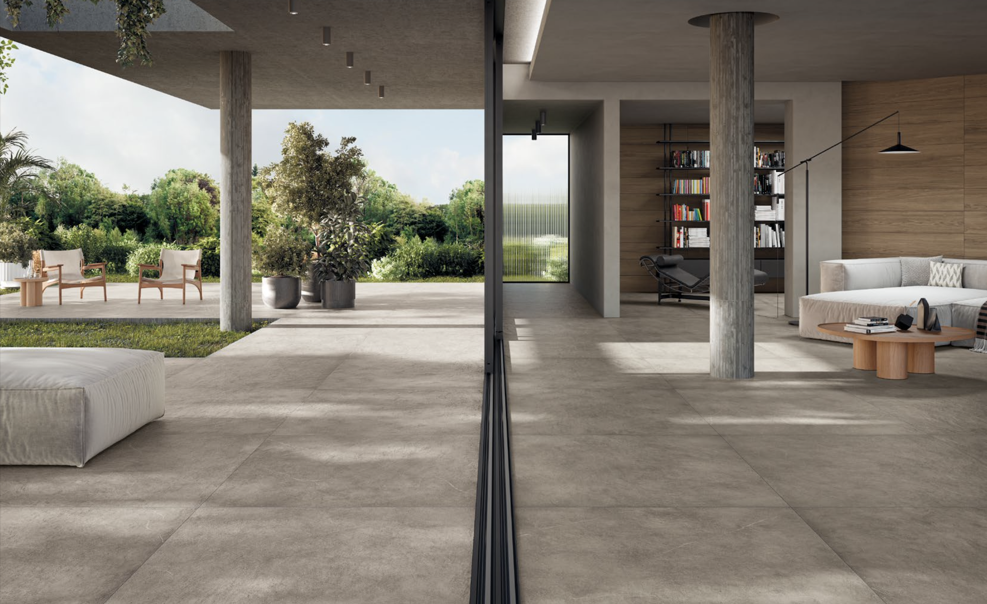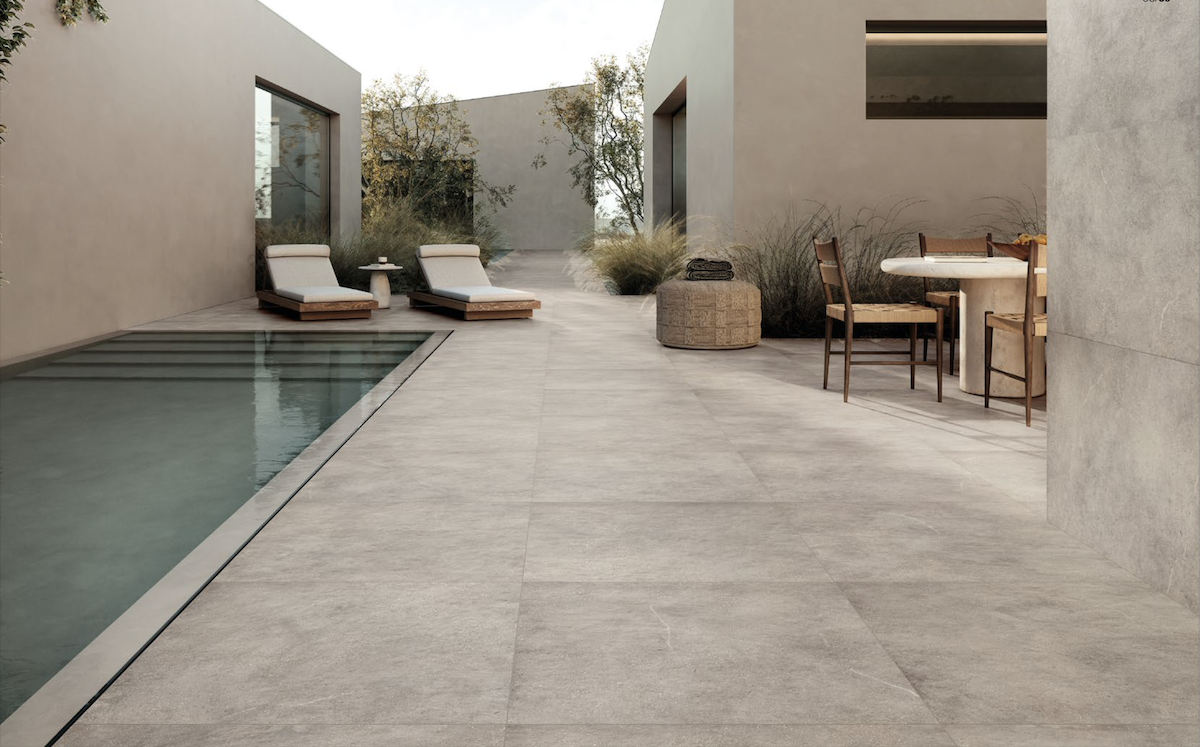






Choosing the right porcelain tile textures for BIM and architectural rendering is an important step in developing realistic digital projects. Beyond colour and pattern, surface finish, material scale and the interaction with light can significantly influence how floors and wall coverings are represented.
For architects and interior designers, digital materials help bridge the gap between visual exploration and product specification, making it easier to evaluate different finishes before selecting them for a project.
Four Refin porcelain stoneware collections are now available on Syncronia: Moon, Ink, Osmos and Eras. Each offers a distinctive interpretation of ceramic surfaces, from iridescent stone effects and expressive graphic patterns to layered concrete textures and natural stone-inspired finishes.
Understanding their characteristics can help designers select the most suitable materials for residential, hospitality, retail and commercial projects.
How to Choose Porcelain Tile Textures for Architectural Projects
When selecting a porcelain stoneware surface, appearance is often the first consideration. However, the final result depends on several interconnected factors.
Colour and graphic variation influence the visual continuity of a floor or wall. Some collections feature subtle, uniform patterns, while others introduce distinctive marks, contrasting shades or more pronounced material effects.
Surface finish determines how the material interacts with light. Matte surfaces generally create softer reflections, while finishes with iridescent details can produce more complex visual effects as lighting conditions change.
Tile dimensions and layout also affect the perception of space. Large-format tiles may create a more continuous appearance with fewer visible joints, whereas smaller formats and decorative elements can introduce rhythm and greater graphic articulation.
Technical performance must be evaluated separately from visual appearance. Architects should verify the suitability of each product for the intended application, considering factors such as slip resistance, thickness, installation conditions and maintenance requirements.
For digital design, an additional consideration is the quality and correct application of the material texture within the architectural model.
The new Refin collections available on Syncronia provide different starting points for exploring these aspects.
Refin Moon: Iridescent Stone-Look Porcelain Tiles and the Role of Light
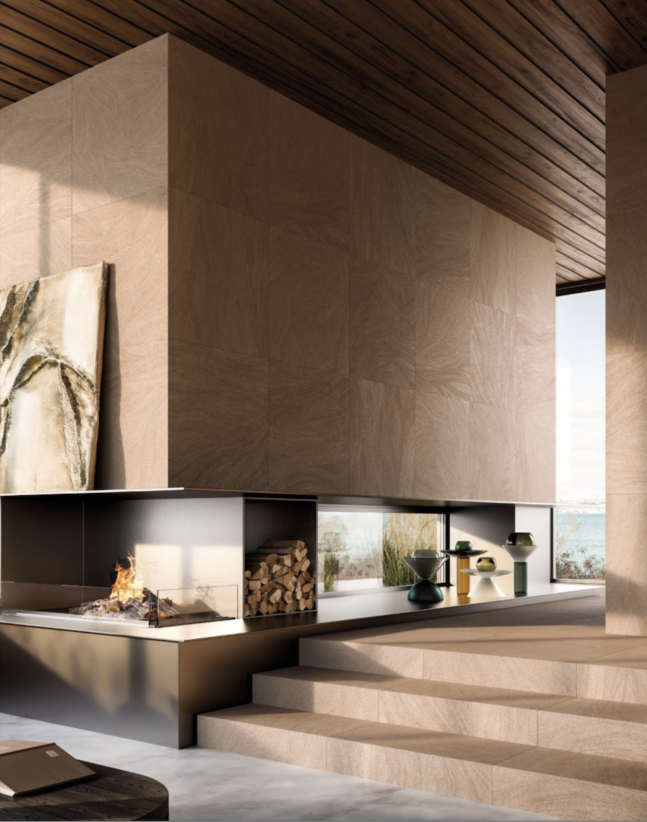
The Refin Moon collection interprets natural stone through luminous surfaces, mineral-inspired inclusions and subtle iridescent reflections.
Its distinctive appearance is created by the interaction between the stone-effect graphic and the material's lustre, which responds to changing light conditions.
Moon is available in five shades: Dark, Eclipse, Glow, Shine and Twilight. Its principal formats include 30×60, 60×60, 60×120, 80×80 and 120×120 cm, with additional large-slab options for selected finishes.
For architects, Moon is particularly interesting in projects where lighting and surface appearance are closely connected.
In residential interiors, for example, the collection can be considered for floors or wall coverings where natural daylight and artificial lighting reveal different aspects of the material.
How to Represent Iridescent Tiles in a 3D Rendering
When creating an architectural visualization with iridescent stone-look tiles, simply applying a colour image may not fully reproduce the complexity of the physical surface.
Lighting direction, reflection settings and the material's surface properties all influence the final result.
Designers should use the manufacturer texture as a visual reference, verify its scale and adjust the rendering material according to the physical finish being represented.
For accurate visualization, it is also useful to compare rendered images with official product photography and, where possible, physical samples.
On Syncronia, Moon offers downloadable JPG textures, Revit material resources, IFC files, a catalogue and technical documentation.
Explore Refin Moon and download textures and BIM resources.
Refin Ink: Graphic Porcelain Tiles for Expressive Interior Design
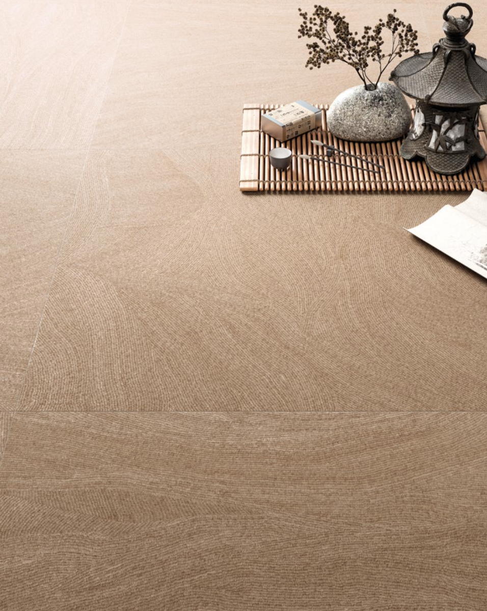
The Refin Ink collection approaches ceramic surfaces from a different perspective, transforming graphic gestures into decorative patterns.
Its design is based on repeated, manually inspired marks that create movement and visual depth across the surface.
Rather than imitating a natural material, Ink uses graphic composition as the defining element of the ceramic finish.
The collection is available in eight shades — Blush, Bold, Cozy, Earthy, Grace, Pure, Quiet and Wavy — in a matte 80×80 cm format.
Its visual character changes according to viewing distance and installation layout, making it particularly suitable for projects where the surface is intended to become a recognizable design feature.
How to Use Graphic Tile Textures in Interior Rendering
When working with decorative porcelain tiles, texture orientation and repetition are especially important.
A graphic pattern that appears balanced on a single tile may create a very different effect when repeated across an entire floor or wall.
For this reason, architects should test the material on a sufficiently large surface within the 3D model, rather than evaluating it only through a small sample.
The correct tile dimensions should be represented, and the pattern should be checked from multiple viewpoints to understand how the design changes with distance.
This approach is useful for retail, hospitality and residential interiors where decorative surfaces contribute to the identity of the space.
Discover Refin Ink and its digital design resources on Syncronia.
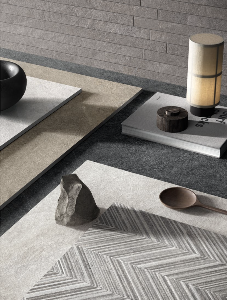 Refin eras natural stone-look porcelain tiles
Refin Osmos: Concrete-Look Porcelain Tiles for Contemporary Spaces
For projects inspired by contemporary and post-industrial architecture, the Refin Osmos collection offers a different material language.
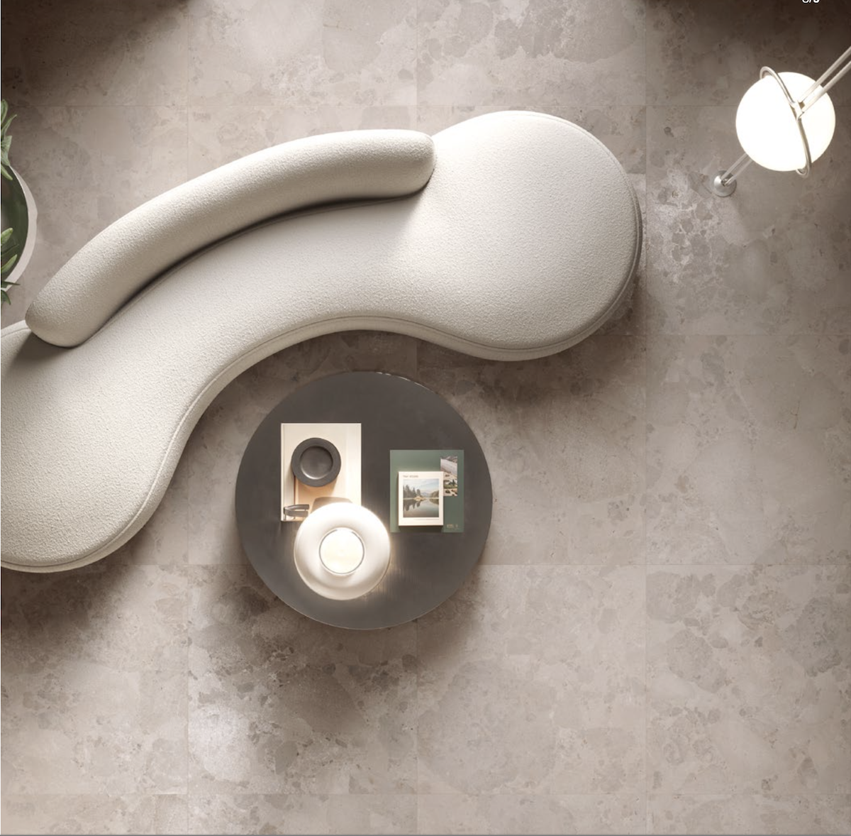
Osmos reinterprets the appearance of concrete through layered visual effects and subtle imperfections, creating surfaces with a distinctive sense of depth.
The collection is available in five shades: Calce, Cenere, Nebbia, Ruggine and Tortora.
Its palette ranges from soft white and cool greys to warmer greige and rust-inspired tones, providing options for different architectural contexts.
Available formats include 30×60, 60×60, 60×120, 80×80 and 120×120 cm, with selected finishes and thicker configurations intended to support continuity between interior and exterior spaces.
How to Create Realistic Concrete-Look Surfaces
Concrete-look porcelain stoneware is often selected for minimalist interiors, contemporary residential spaces, retail environments and contract projects.
In architectural rendering, the main challenge is maintaining the balance between material character and visual uniformity.
Repeating the same texture without considering its natural variation can make a large surface appear artificial.
Designers should therefore pay attention to material scale, tile joints, graphic variation and the relationship between the surface and the surrounding lighting.
It is also important to distinguish the appearance of concrete from the actual construction material: Osmos is porcelain stoneware, not cast concrete.
For projects that extend from interior floors to terraces or other outdoor areas, the designer must verify which specific colours, formats and finishes are approved for each application.
Explore Refin Osmos and its downloadable materials on Syncronia.
Refin Eras: Natural Stone-Look Porcelain Tiles for Indoor and Outdoor Design
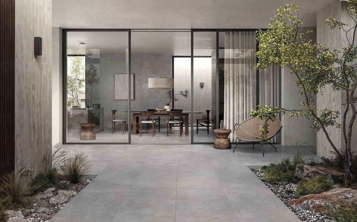
The Refin Eras collection takes inspiration from the natural transformation of stone over time.
Its surface design evokes the effects of water, wind and geological pressure, creating fluid graphic patterns reminiscent of sedimentary materials.
Eras is available in six shades: Black, Greige, Grey, Ivory, Sand and White.
The collection includes matte finishes, selected grip options and decorative elements, including three-dimensional reliefs and mosaics.
The principal tile formats are 30×60, 60×60, 60×120 and 120×120 cm, with additional options for specific applications.
How to Specify Stone-Look Tiles for Interior and Exterior Spaces
When selecting stone-look porcelain tiles, architects should consider both visual continuity and functional requirements.
A consistent colour palette can help connect indoor and outdoor environments, while different surface finishes may be needed depending on the installation area.
For example, an interior living space and an exterior terrace may require different surface characteristics even when the same collection is used.
Slip resistance, weather exposure, installation systems and the applicable product specifications must be evaluated for each area.
In architectural visualization, the natural stone-inspired graphic should also be represented at the correct scale, avoiding excessive repetition or unrealistic material continuity.
The decorative and three-dimensional options available within Eras provide additional possibilities for creating accent walls and more articulated architectural surfaces.
Discover Refin Eras and access its digital product resources.
How to Apply Porcelain Tile Textures in Revit and 3D Rendering Software
Whether working with a stone-look, concrete-look or decorative porcelain tile, the correct application of digital textures is essential for producing reliable architectural visualizations.
A practical workflow begins with the selection of a specific manufacturer product and its corresponding colour, size and finish.
The next step is to obtain the digital resources available for that configuration.
When using Autodesk Revit, designers can work with material libraries or create and edit materials through the Material Browser, assigning the appropriate visual appearance to floors, walls or other architectural elements.
In rendering software, downloaded texture images can be used as the basis for material definition.
To obtain a more realistic result, several checks are recommended.
Use the correct material scale.
A texture should correspond to the dimensions of the physical tile. Incorrect scaling can distort the appearance of the finish and the proportions of the design.
Check texture orientation and repetition.
This is particularly important with directional graphic patterns and stone-inspired surfaces.
Represent tile joints.
Grout width, alignment and layout influence the final perception of the surface and should be considered where relevant to the visualization.
Adjust lighting and reflection properties.
Different finishes respond differently to natural and artificial light. Rendering settings should be consistent with the actual material rather than based on generic assumptions.
Verify the physical product specifications.
A visually realistic material does not automatically represent the product's slip resistance, thickness, technical performance or installation requirements.
For physically based rendering workflows, additional material maps may be required. Their availability should be checked in the downloaded resources rather than assumed from the presence of a JPG texture.
These steps help architects create more accurate presentations while maintaining consistency between the digital model and the intended physical material.
New Refin Collections on Syncronia: Download Textures and BIM Resources
With Moon, Ink, Osmos and Eras now available on Syncronia, architects and interior designers can explore four different approaches to contemporary porcelain stoneware.
Moon focuses on luminous, iridescent stone effects; Ink introduces expressive graphic compositions; Osmos interprets the layered appearance of concrete; and Eras draws inspiration from the textures of natural stone.
Their differences make them suitable for exploring a variety of architectural concepts, from restrained, material-focused interiors to decorative environments and projects requiring visual continuity between spaces.
Syncronia provides dedicated product pages where designers can consult the resources made available by Refin, including texture images, digital design files, catalogues and technical documentation according to the specific collection.
These resources can support material selection, BIM workflows and architectural rendering, helping professionals move from visual experimentation to the development of project specifications.
Explore the new Refin collections on Syncronia:
For a wider selection of ceramic surfaces and digital design resources, visit the Refin manufacturer library on Syncronia.
Access to downloadable files is available through Syncronia following free registration.