Descrizione
DIGUSTO - Semplicità ed eleganza [il sapore prende la sua forma]
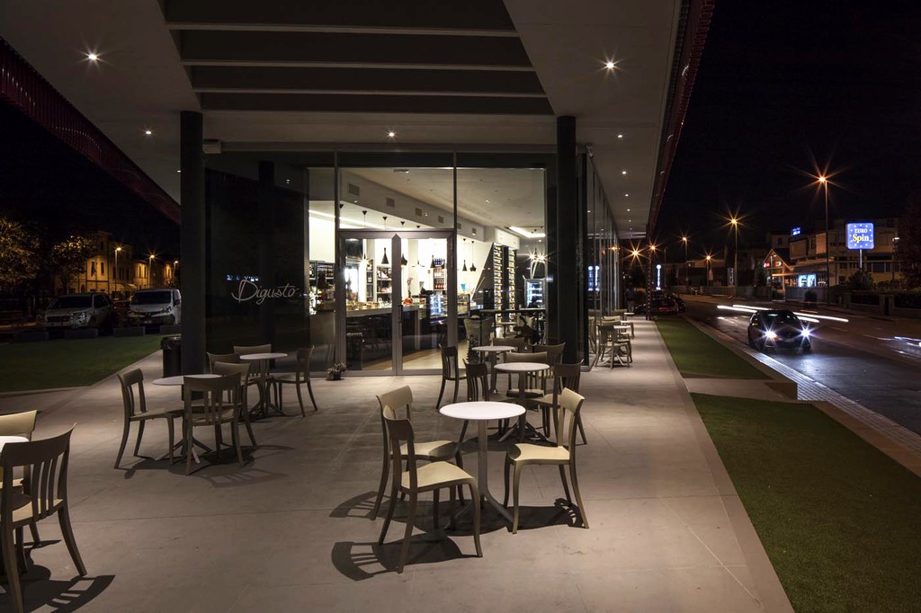
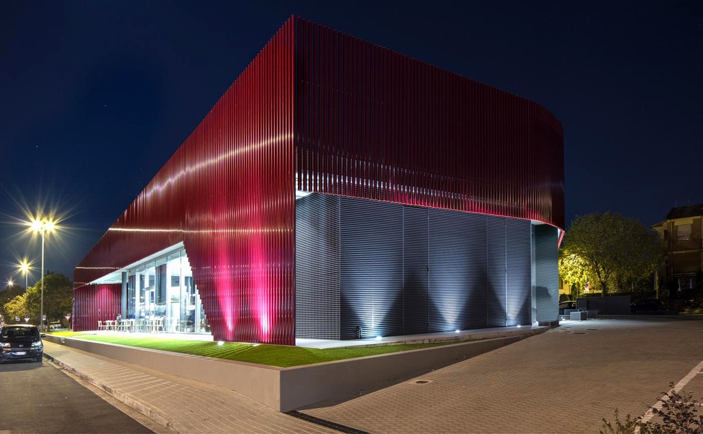
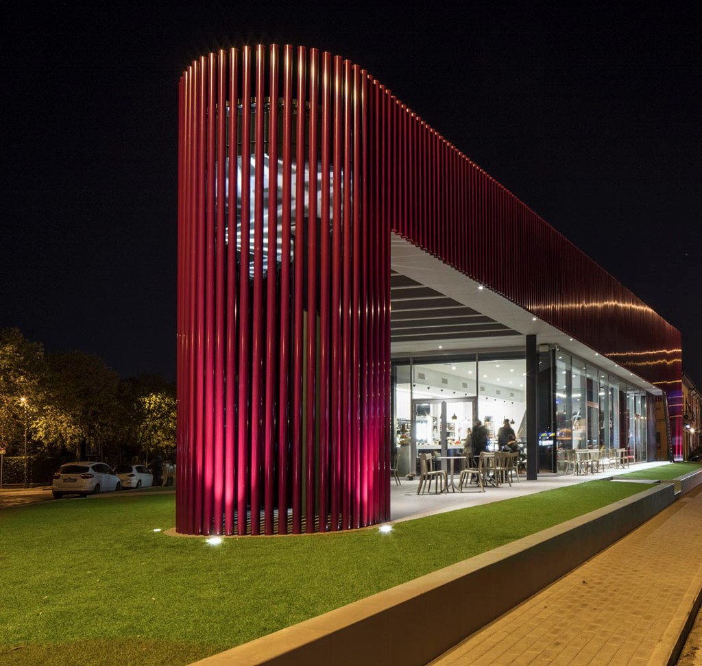
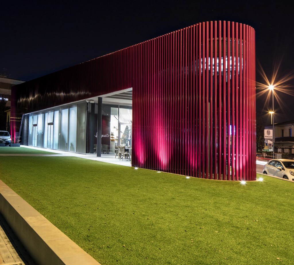
Digusto si sviluppa sul piano terreno di un fabbricato di nuova costruzione, in un recupero di una vecchia stazione di servizio, ubicato lungo l'arteria principale che attraversa la cittadina di Pontedera, il luogo di origine della PIAGGIO.
L'idea del titolare, pasticcere con esperienza decennale, è stata quella di combinare all'interno di un unica attività tutta l'essenza della gastronomia per raccogliere i sapori del Made in Italy orchestrato da professionisti di più settori culinari.
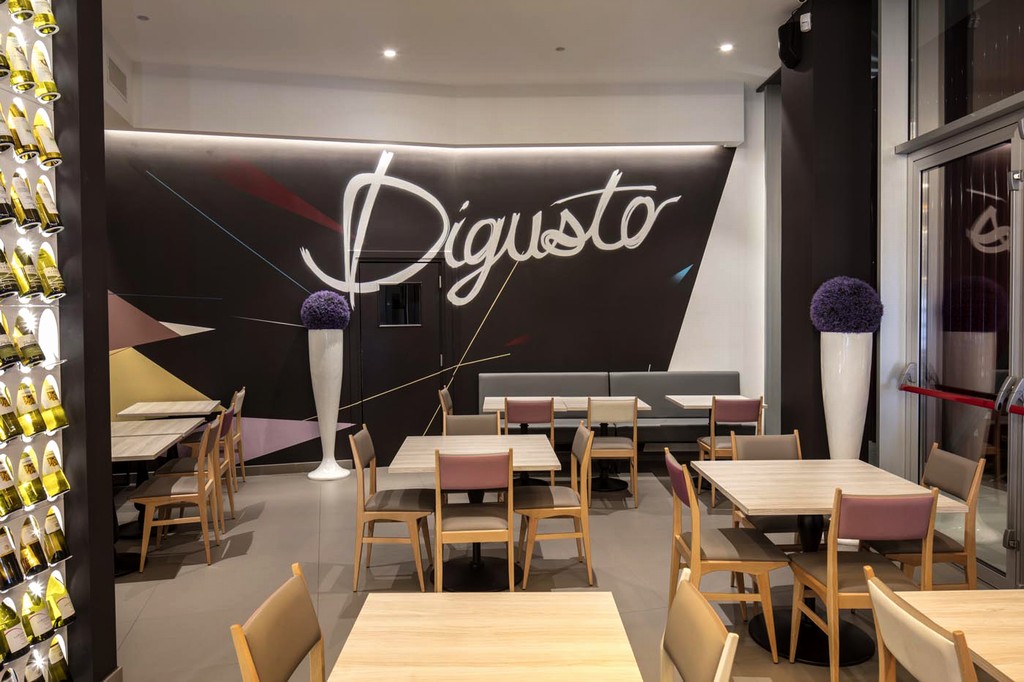
Partendo dallo studio del nome – DIGUSTO (un'idea del team Studiounodesign) che nasce come unica parola dalla locuzione “DI+GUSTO”. Digusto è il brand, la qualità, il lifestyle, il desiderio di godere del servizio e dell'accoglienza e dell'unicità del luogo. Volutamente semplice, decisamente Italiano, Digusto deve rappresentare la semplicità e la genuinità. L'idea di rendere la locuzione un'unica parola è nata per caricare il Brand di una forza comunicativa capace di restare incollata nella memoria dell'utente. Digusto nasce per giocare con la comunicazione del locale in ogni suo utilizzo. (es: L'Aperitivo Digusto!, Digusto non ne hai mai abbastanza, ecc...)
Il progetto del locale è stato basato principalmente sulla funzionalità nella distribuzione delle varie aree e gli ambienti sono stati pensati con forme semplici e pulite in un design concettuale e moderno.
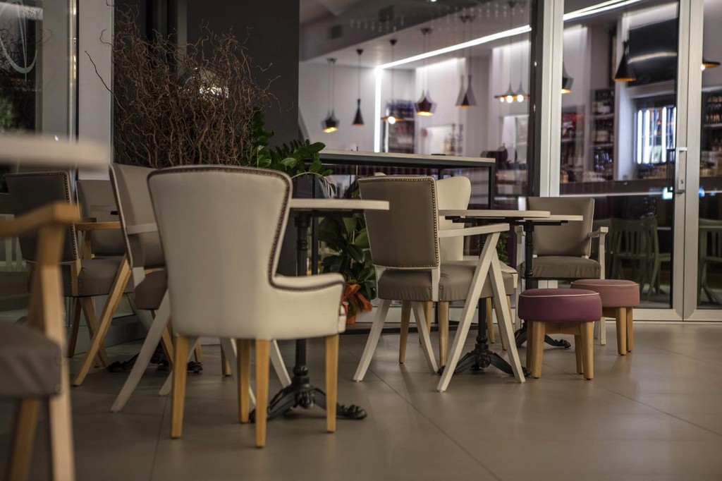
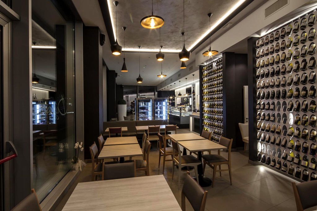
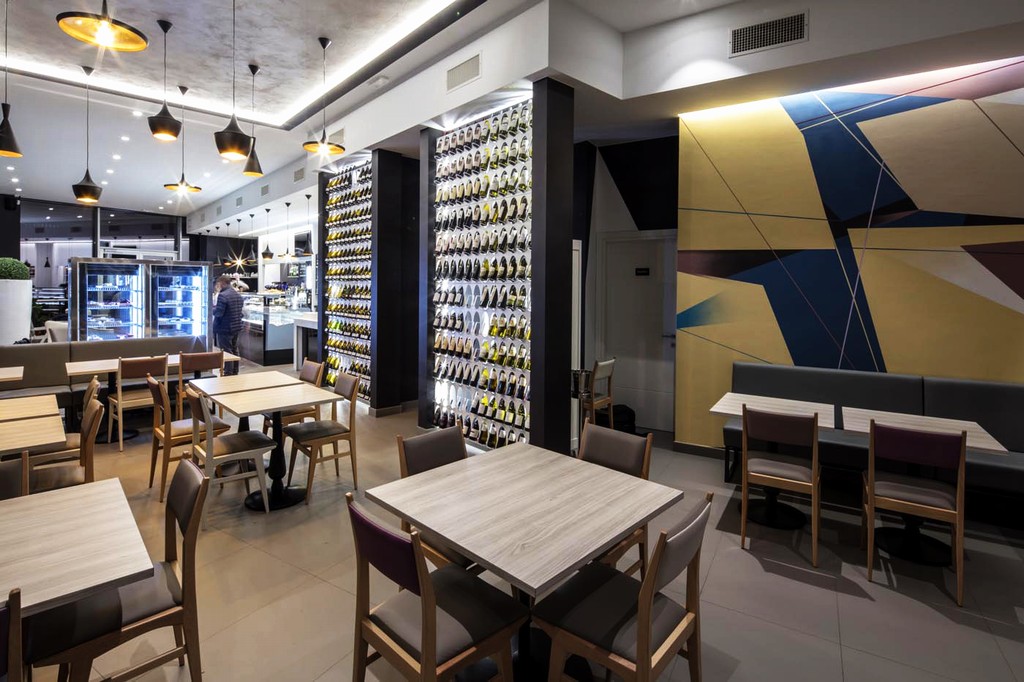
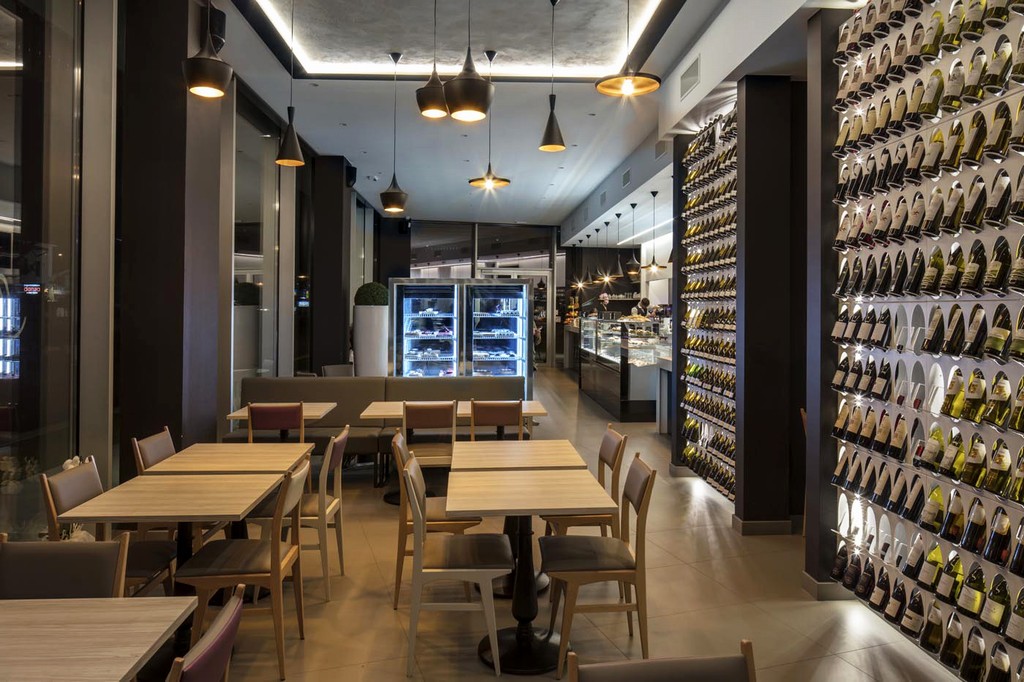
Lo spazio principale è una lunga e stretta sala con colonne regolari e ampie vetrate.
Questo ha presentato una sfida per i progettisti, che hanno voluto mantenere e anche sottolineare la lunghezza dello spazio creando tre distinte zone di sedute e attraverso la linea dinamica della bancone di fornire un luogo ideale che fosse adeguato sia a colazione che come american bar per gli aperitivi.
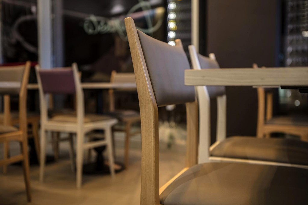
Gli arredi ed i decori ricordano uno stile più classico per rendere gli ambienti caldi e familiari.
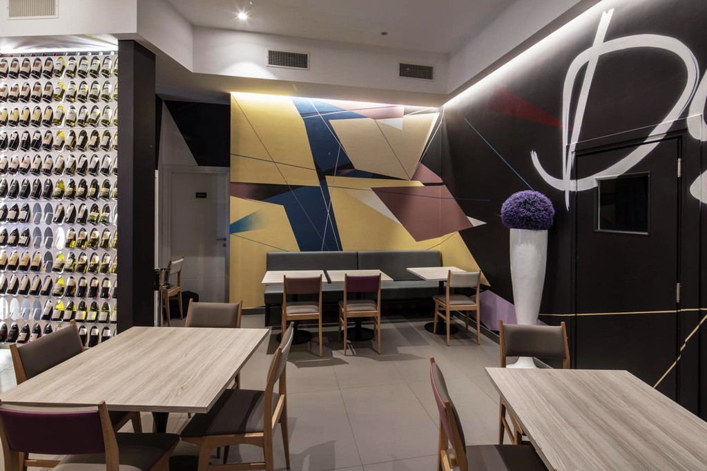
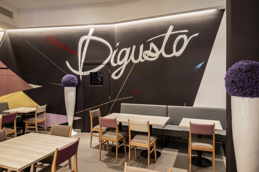
I toni predominanti molto scuri e decisi creano un fondale sul quale si alternano nuance delicate con sfumature che dai beige e grigio perla attraverso piccoli tocchi passano nelle quattro diverse tonalità di violetto.
Le linee dei divanetti in pelle grigio perla e ferro nero, si interpongono alle sedie in pelle e legno, e ai tavoli quadrati caratterizzati da un basamento in ghisa nero in netto stile retrò, oltre a creare un vero e proprio confine tra l'area del bar e quella del ristorante.
La scelta delle nuance delle pelli delle sedute, con tappezzeria di alta qualità ed artigianalità, è un'indelebile segnale della selezione dei prodotti di qualità, simbolo della stessa produzione Digusto.
Le sedute dell'area bar rievocano una atmosfera confortevole, come un salotto fuori casa, mentre le postazioni delle aree ristorazione permettono di poter gestire al meglio i diversi momenti della ristorazione.
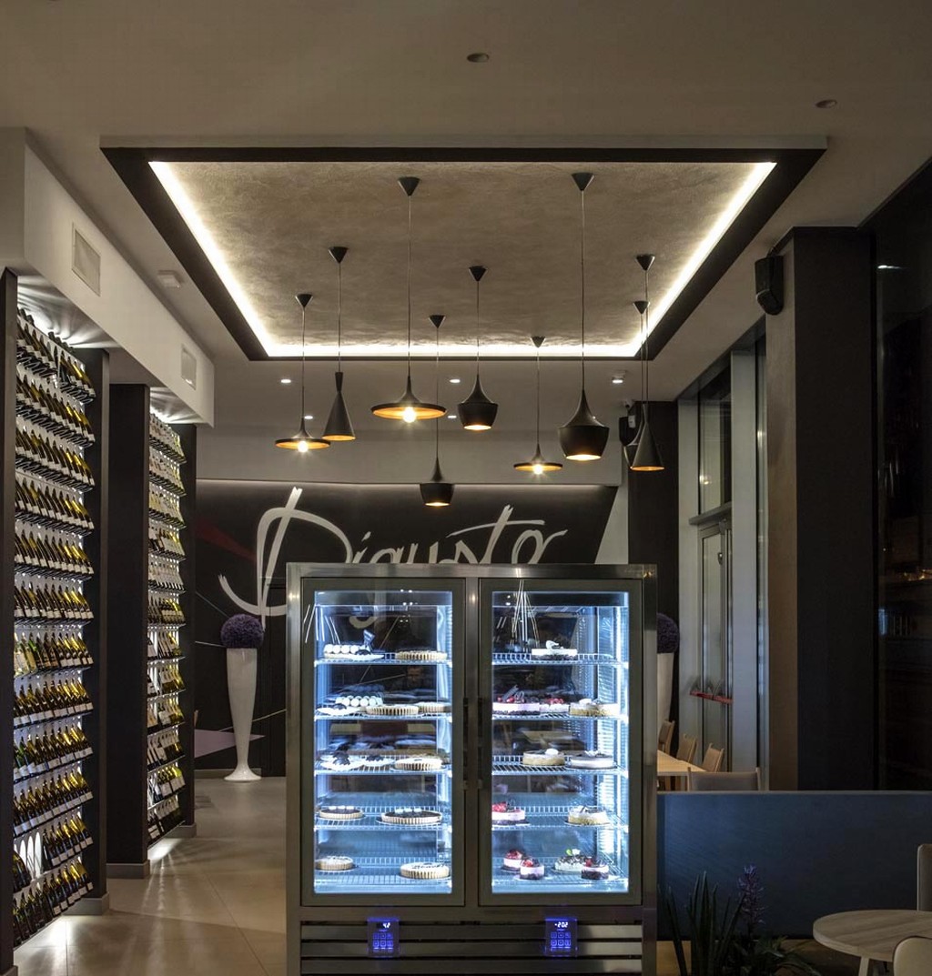
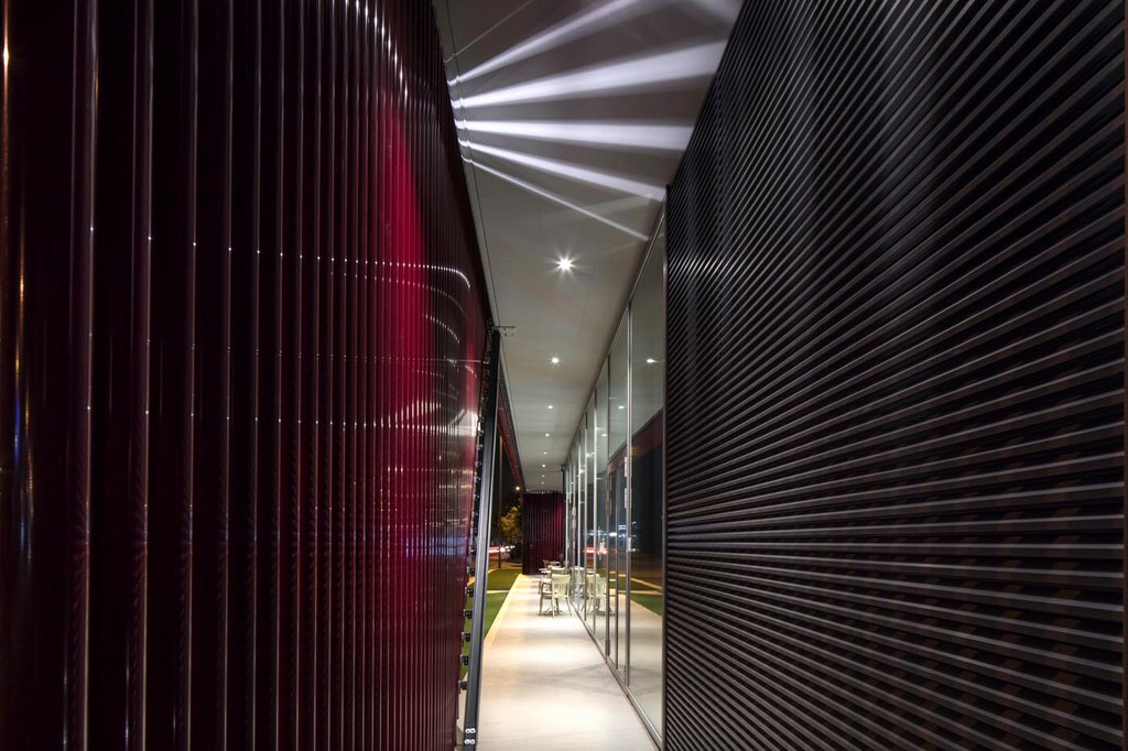
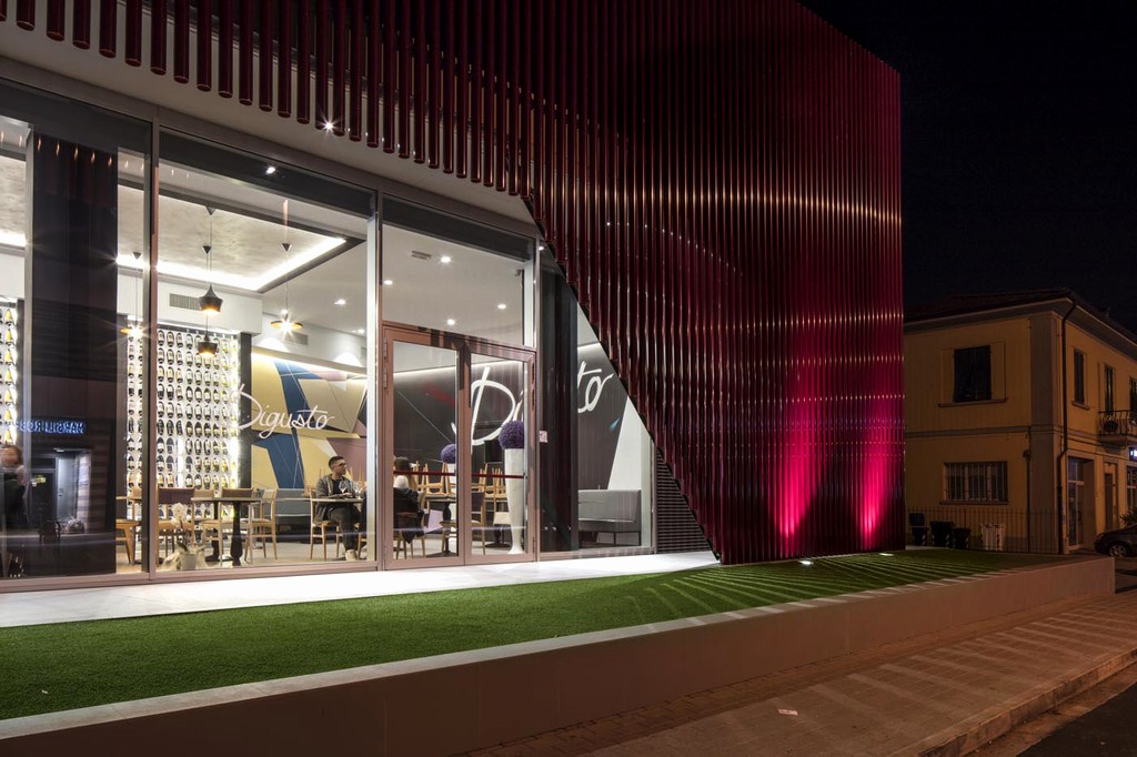
I raffinati complementi d'arredo ed i dettagli, appositamente selezionati, sono inseriti in una cornice di luci a LED che si sviluppano lungo le pareti interne, illuminazione che dall'esterno valorizza e armonizza l'intera linea dell'arredamento che corre lungo l'intera vetrata del prospetto principale.
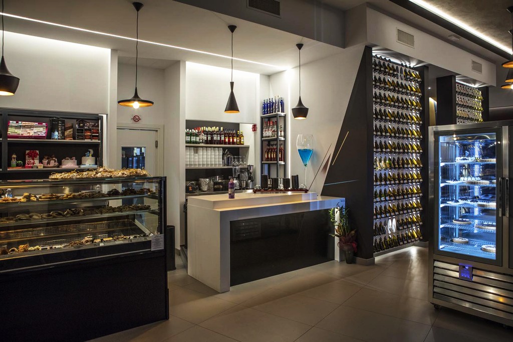
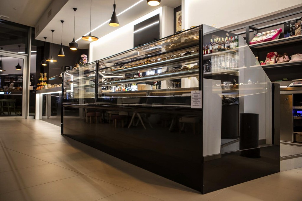
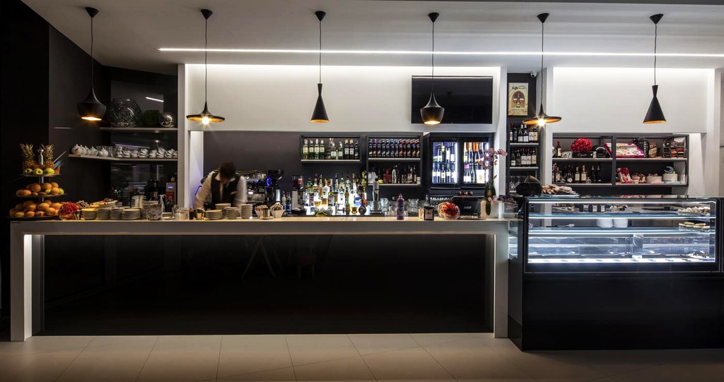
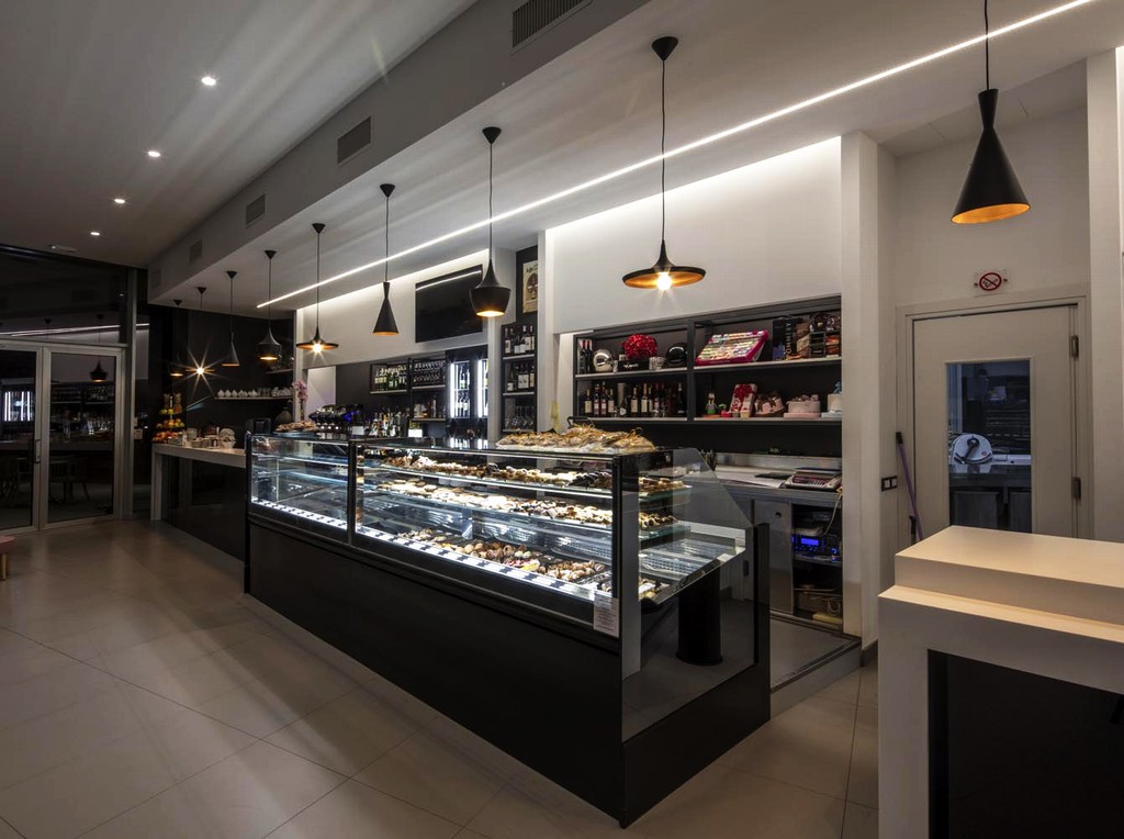
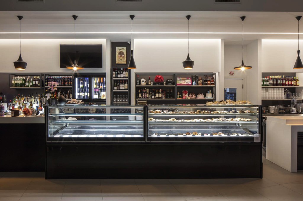
Il banco bar, posizionato come punto di unione tra i due ingressi principali, si estende su di una lunga bancalina composta da un portale in corian in colore bianco che contrasta dai fondali dai colori decisamente più scuri.
La linearità dell'elemento bancone si caratterizza dalle ampie vetrine espositive della pasticceria.
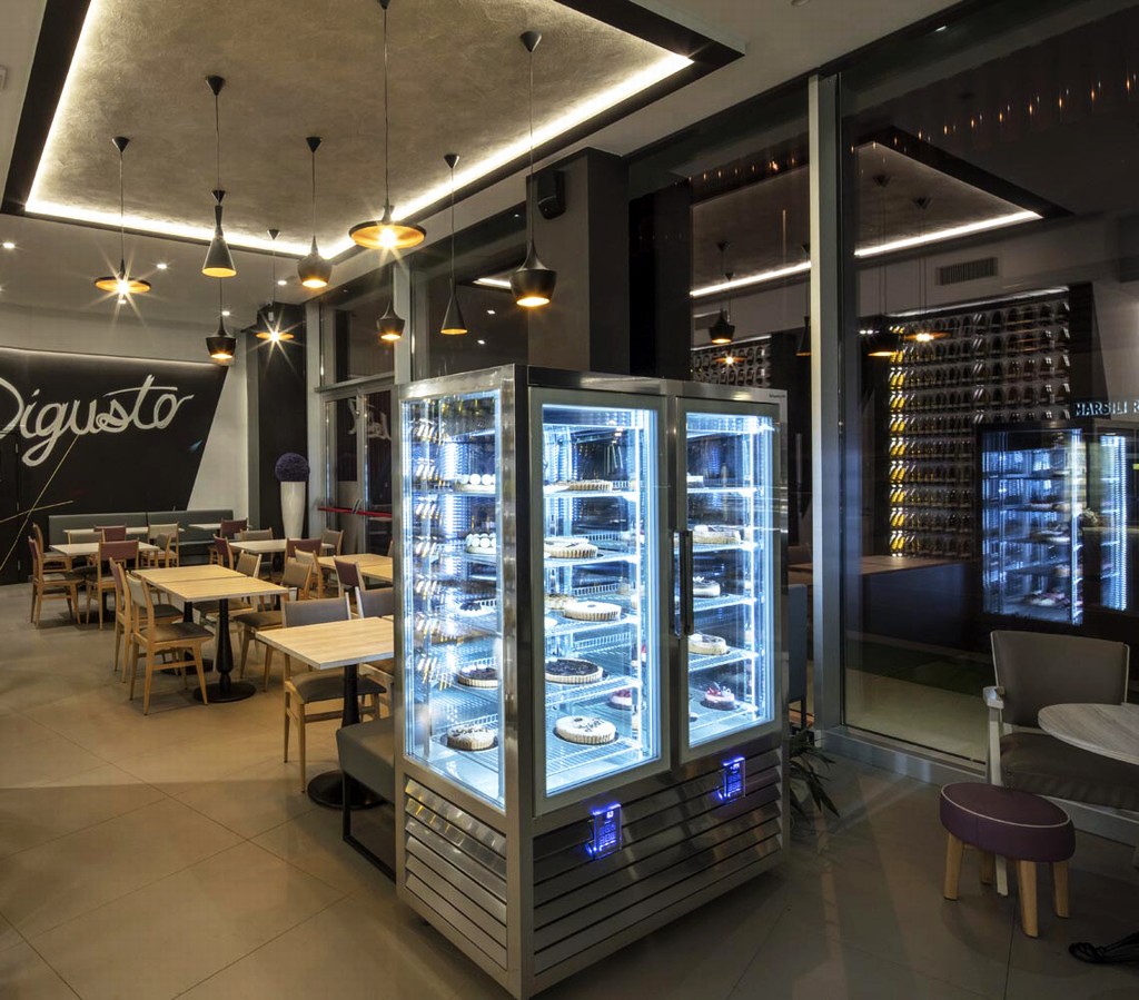
Un blocco staccato dal resto del bancone principale accoglie la vetrina gelato. Innovativa e fuori dagli schemi delle classiche vetrine gelato, il banco è dotato di pozzetti, carapine, con illuminazione a LED che fanno risaltare i colori naturali del prodotto alla vista del cliente.
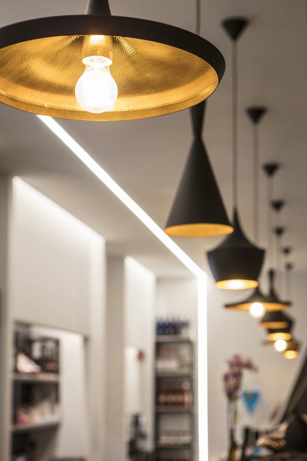
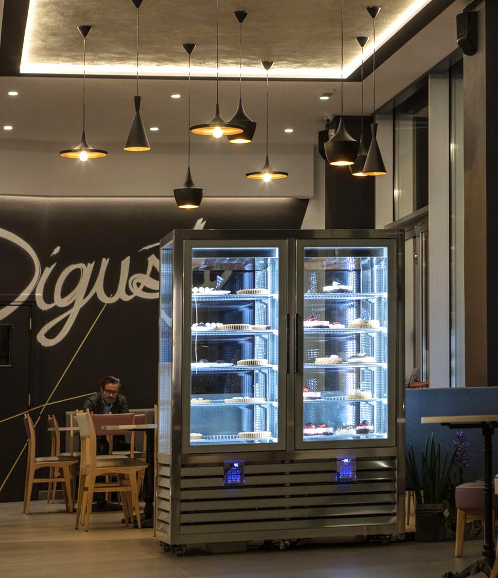
Le lampade a sospensione di colore nero opaco all'esterno e in ottone all'interno si collegano alle altre strutture metalliche in stile industriale presenti nel locale. Il contrasto tra i due materiali che le compongono si amplifica una volta accese, infatti le forme sinuose ed eleganti delle lampade si contrappongono alle linee nette e decise del resto del locale con richiami alle forme passate di vecchie pentole e di recipienti d'acqua.
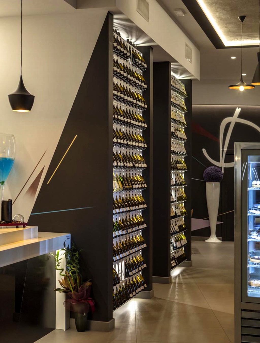
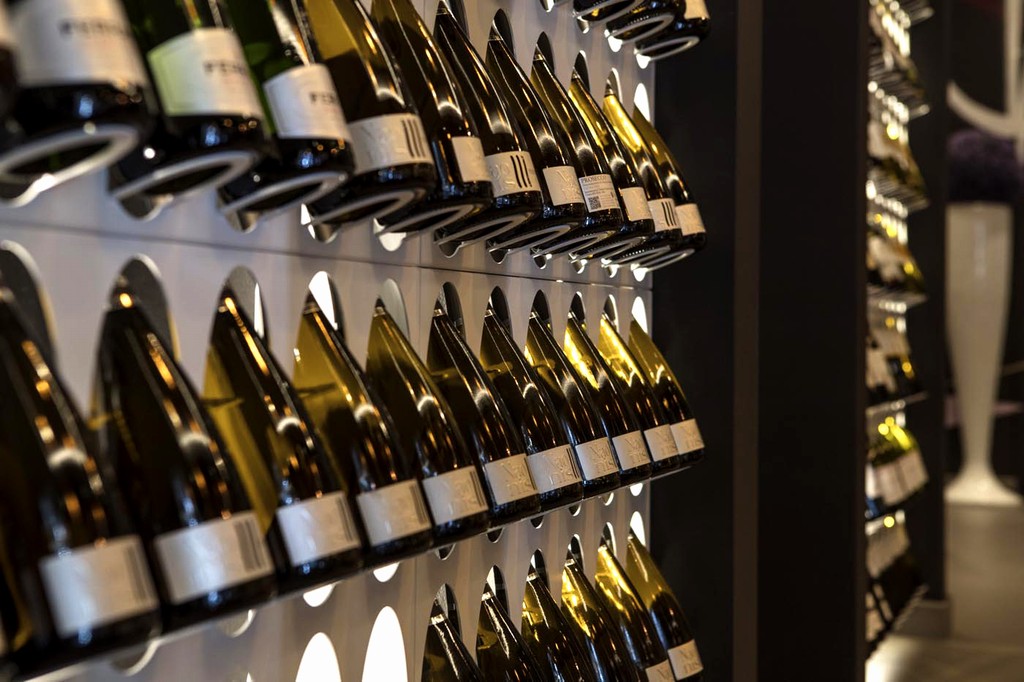
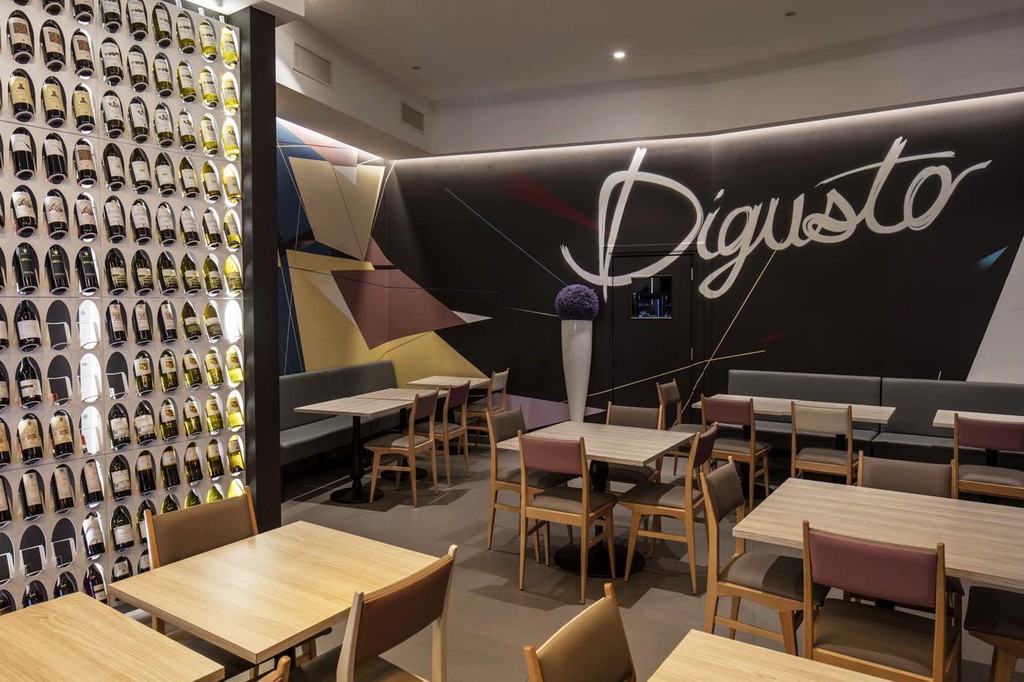
Il blocco di pareti che scherma l'ingresso ai bagni dei clienti è composto da portabottiglie modulari a parete che mettono in mostra in modo elegante e funzionale le varietà di bottiglie esposte. Realizzati in ferro tagliato a laser, colorato in chiaro per essere in contrasto con il fondale scuro dell'ambiente sono evidenziati anche dall'inserimento di luci a LED poste sul retro dei moduli. (collezione ENO di Elite, to be). Una grande idea che valorizza ed unisce l'area bar a quella del ristorante.
I motivi decorativi presenti, specialmente alle pareti della zona ristorante, sono stati realizzati grazie alla collaborazione con EDF crew.
***
DIGUSTO – Simplicity and style [where taste takes shape]
Digusto is on the ground floor of a newly renovated building which was once a service station on the main road of Pontedera, the industrial town which is home to the famous Piaggio company.
The idea of the owner, a pastry chef with many years of experience in the field, was to combine within the same business all kinds of Made in Italy delicatessen, handmade by professional chefs of different culinary arts.
Starting from its name, DIGUSTO (a Studiounodesign idea), was developed as the merging of an Italian expression (“di gusto”). Digusto means brand, quality and lifestyle, a place where you can enjoy good service and a welcoming environment where you can appreciate the uniqueness of its setting. Intentionally modern, though definitely Italian, Digusto aims for simple style and healthy food. Turning the Italian expression into a single word makes it easier to remember and so leaves its mark on the customers’ memory. Digusto allows the use of other expressions and meanings (i.e. Digusto the appetizer!, You can never get enough of Digusto, etc.)
The design of the coffee bar is in line with the idea of functionality in terms of the arrangement of space, which was intended to be simple and tidy and in a conceptual and modern style.
The main area is long and narrow with pillars and floor-to-ceiling windows.
Designing Digusto was, however, a challenge for Studiounodesign which wanted to preserve and emphasize the length of the space, so as to create three different areas and provide a perfect setting for everything between breakfast and happy hour.
The furniture and decor are classic, so as to make the environment warm and friendly.
The rather dark and sharp tones create a background of delicate nuances ranging from beige to pearl-grey with four varying shades of lilac.
The design of the pearl-grey and black-iron leather couches is in contrast with the leather and wooden chairs and with the square tables that have a black base of cast iron in retro style. This also creates a boundary between the coffee bar and the restaurant area.
The different shades of the leather seats, with high-quality handcrafted upholstery, is a remarkable sign of state-of-the-art product selection, which is also our greatest source of pride.
Our refined furnishing accessories and their highly selected details are framed by LED lights that run along all the interior walls. Seen through the floor-to-ceiling windows from the outside, the lighting enhances the space and gives harmony to its furniture.
The bar counter, which runs between the two main entrances has a countertop in white Corian, which is in contrast with the much darker background.
The linearity of the bar is expressed by the floor-to-ceiling windows of the pastry and coffee bar.
Detached from the main counter there is the ice-cream display counter. The unique, cutting-edge counter is equipped with wells and tubs and LED lights to highlight the natural colours of the ice-cream on display.
The mat black (outside) and brass (inside) hanging lamps are consistent with the other metal elements in the typical industrial style of Digusto. The contrast between the two materials is amplified when the lamps are on, while the winding and elegant form of the lamps is offset against the sharp lines of the bar and tends to bring to mind an image of old pots and jars.
On the walls between the bathrooms and the customer area there are modular bottle racks which elegantly and functionally display the different bottles. They are made of laser-cut iron, with light colours to intentionally create a contrast with the dark background and spotlighted by LED lamps behind the panels (ENO Collection by Elite, to be). It’s a great way of enhancing and uniting the bar and the restaurant areas.
The decorations, especially on the wall of the restaurant area, were designed in collaboration with EDF crew.
Galleria immagini