In our language the word "contrast" often takes on a negative connotation, but in the history of color and therefore of aesthetics this is not always the case, on the contrary: it is precisely the coupling of what is dissimilar, sometimes completely antithetical, to generate a fruitful harmony. Think of Pantone's choice of 2021 to put together two meanings and two colors so distant from each other, Yellow and Gray.
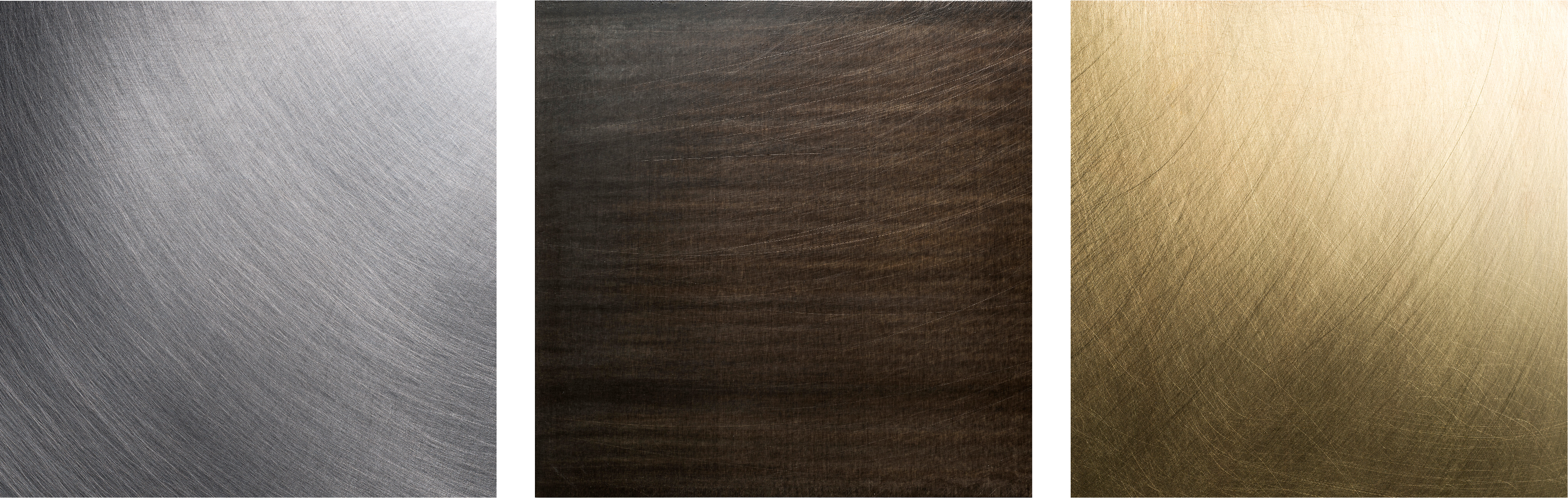
This is one of the cases to consider for Planium metals, since with their chromatic diversity these light up each other in an Interior Design project. The Tiziano red of the Copper, for example, can make a pleasant “contrast” if placed next to the Air Force Blue of the Calamine, or a cold brushed stainless steel. All types of steels work well with dark Calamine, but above all warm tones: a metal, for example, with golden shades such as Brass. Then there is the possibility of daring and playing with more unexpected and unusual, less classic, almost completely new combinations: bringing the brown Oxidized Steel closer to the Stainless Concrete - which is light gray; or finalize a composition with multiple metals using Calamine as a watershed to generate different series.