Acoustic panels
Bathroom
Building
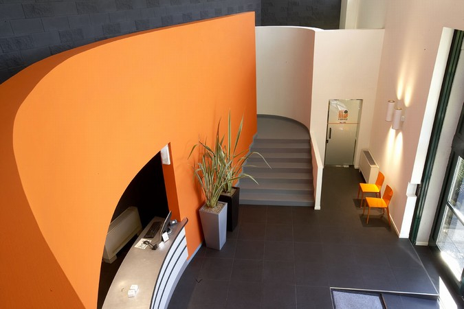
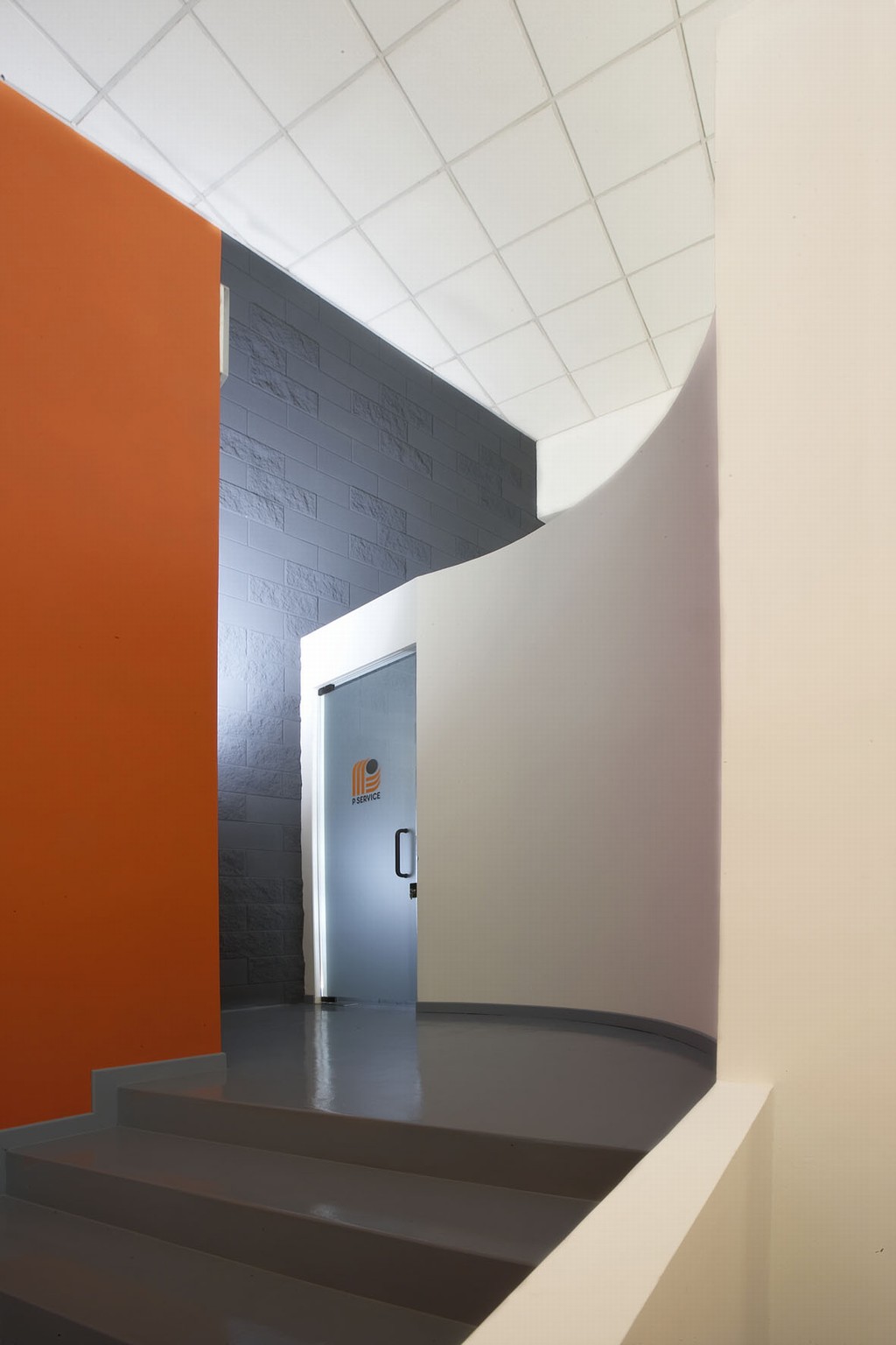
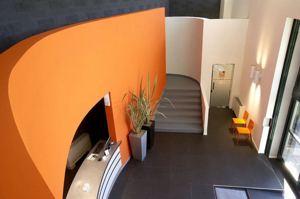
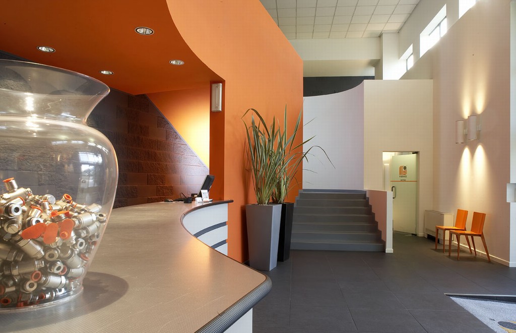
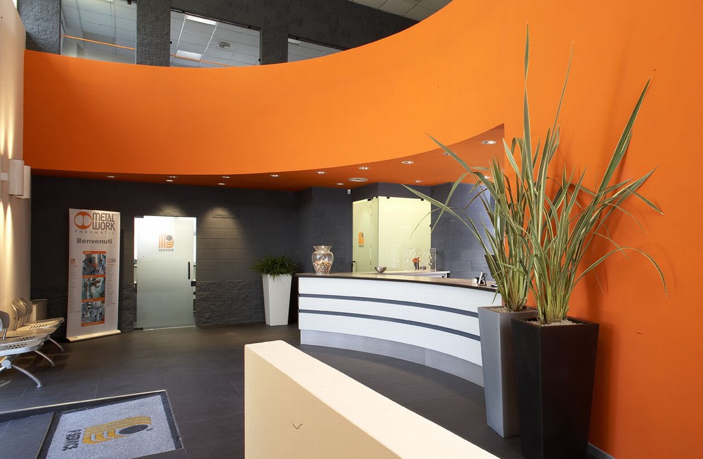
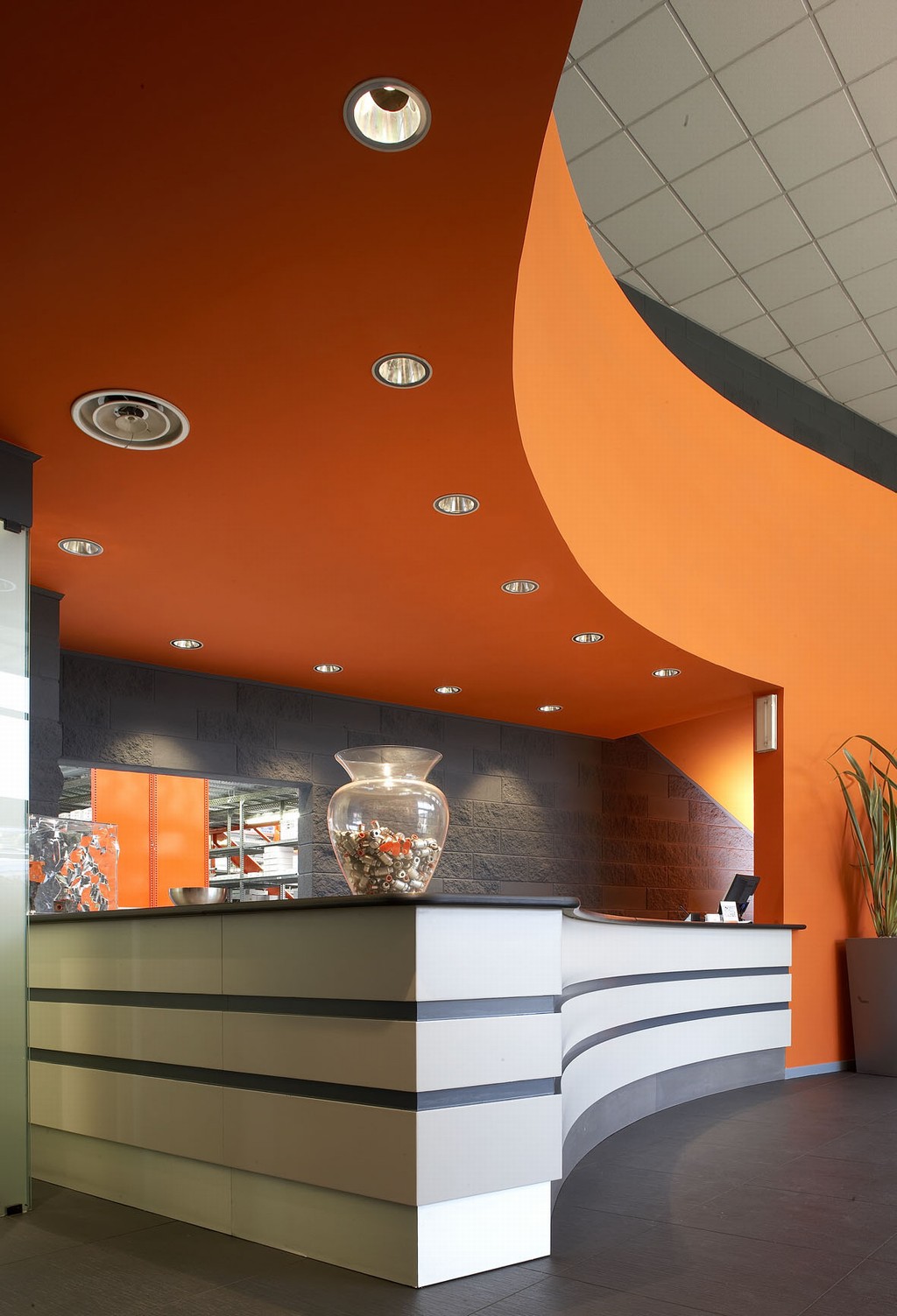
Contract and public places
Doors and windows
Finishes
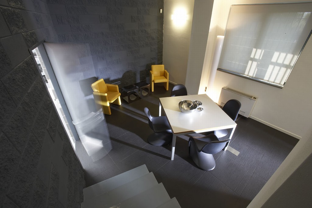
Furniture
Home decor and furnishing accessories
Installations and heating
Kitchen
Lighting
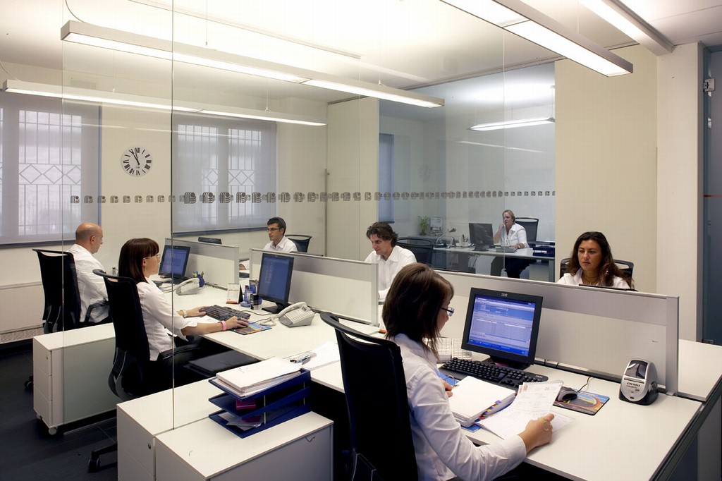
Offices
Outdoor
Smart home
Ceramic tiles
Doors finishes
External and internal cladding, facades, and masonry
Fabrics and carpets
Indoor and outdoor floors
Laminates and metals
Mosaics
Other materials
Roofing
Stone
Wallpaper
Wood