ICONS Cafe
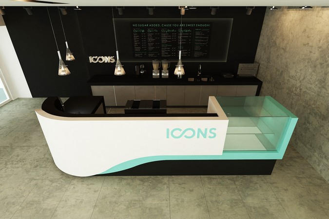
ICONS Cafe, stand design
THE CONCEPT
ICONS + cafe + couture + tirqoise + remarkable
The general concept derived from these input motives.
Space and the morphology of the stand needed to
correspond with these motives in a way that they
appear as one. The curved lines were introduced in
order to interconnect something that is iconic but also
uid and light.
THE MORPHOLOGY
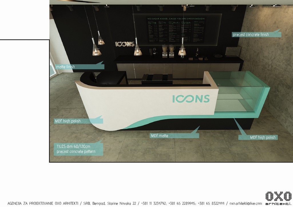
We wanted to soften the angle and to make the stand
less agressive as a form in space. It is also more
accessible to the users.
AMBIENT
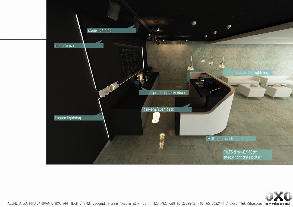
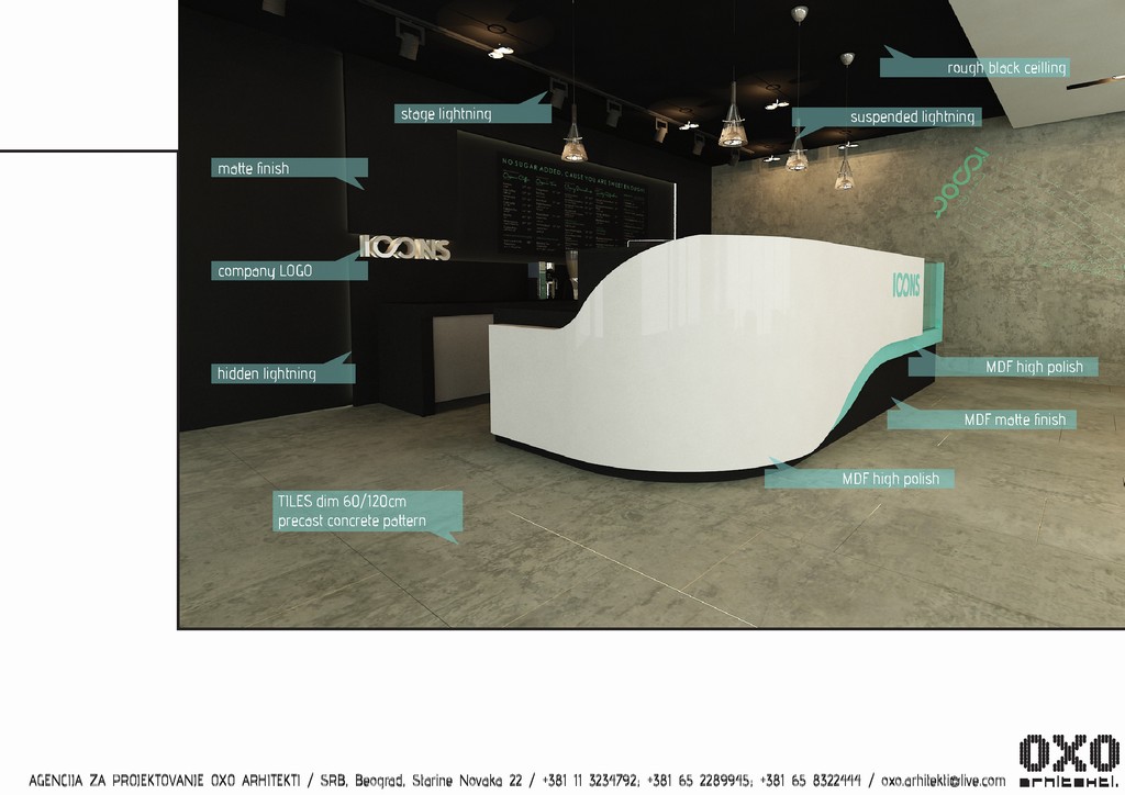
The stand needed to have its own background (stage)
so me made small ambient in wich the stand is going
to be placed. We le the original ceeling hight and
painted it black, as well as the back wall of the stand.
MATERIALS
Are a combination of high polish and matte finish in
MDF or dry wall. Floor is covered in large tiles with
unfinished concrete appereance.
LIGHTNING
We introduced several lightning types. General, with
recesed lightning, suspended lightning above stand,
stage lightning toward the back wall and hidden lightning
Friday, August 29, 2014 - 22:25
