Bonus 110: PARTNERSHIP TRA RETE RILANCIO ITALIA E SYNCRONIA il portale di rifermento del mondo professionale

Siglata la partnership per il lancio della Piattaforma RILANCIO ITALIA che permette ai professionisti italiani la gestione del Superbonus 110 % in maniera facile e veloce.  


----------------------------------------------------------------------------------———-


Syncronia ha scelto di diventare media partner della Rete Rilancio Italia per dare l’opportunità ai professionisti italiani di poter diventare attori protagonisti nel complicato processo di far accedere le famiglie italiane al Superbonus 110.

La piattaforma Rilancio Italia è lo strumento tecnologico all’avanguardia che è stato realizzato con il supporto di professionisti, legali, assicuratori ed esperti nel settore della finanza per permettere di affrontare in maniera organica e strutturata i molteplici aspetti della normativa legata al Superbonus 110.


Gli oltre 170 documenti necessari per la gestione di una singola commessa possono disorientare e spaventare ma se vengono gestiti con la piattaforma tecnologica Rilancio Italia non sono più un problema. La piattaforma segue il professionista passo dopo passo con informazioni, alert, blocchi, strumenti ad hoc per risolvere i molteplici dubbi che sorgono quando si affronta una realtà così complessa.  

Alberto Costa, Presidente della Rete Rilancio Italia ed Alfercom srl, ideatore della piattaforma, dichiara ”nella realizzazione della piattaforma abbiamo ascoltato la voce dei professionisti coinvolti, grazie a loro,  abbiamo costruito una infrastruttura informatica tailor made sulle necessità di chi ci lavora, utilizzando anche la nostra decennale esperienza per la gestione di commesse di grandi infrastrutture”.


Carlo Bardelli, ammin. Delegato di Syncronia, puntualizza “abbiamo esaminato con grande attenzione le molteplici offerte presenti sul mercato ma siamo felici di aver trovato l’unica piattaforma che non è costruita per per un controllo documentale, per permettere lo smobilizzo del 110% da parte degli istituti finanziari. La piattaforma informatica Rilancio Italia invece, è lo strumento che segue il processo ed il professionista dalla sua gestazione allo smobilizzo finale”.


Syncronya srl, attraverso il Suo portale ed il suo magazine, in qualità di Media Partner, raggiugerà con i suoi consolidati strumenti e canali, i tecnici - architetti, ingegneri, geometri – le Aziende, per far loro comprendere, le peculiarità e le importanti funzionalità della Piattaforma Rilancio Italia 2020 dando la possibilità di utilizzarla a condizioni tariffarie agevolate.


La piattaforma permette ai professionisti di risolvere le domande delle famiglie che, entusiaste in un primo momento dalla straordinaria opportunità offerta dallo Stato Italiano, stanno ora pensando di lasciar perdere, spaventati dalla complessità delle pratiche da predisporre.


Con l'utilizzo della Piattaforma Rilancio Italia anche il più difficile e complesso degli iter può essere affrontato con fiducia e darà la possibilità di accedere al Superbonus ad un ampio numero di italiani.


Al termine del processo il visto di conformità per poter accedere al Superbonus 110 viene rilasciato da CAAF/ Cgil, il più grande CAAF ITALIANO, che ha siglato un apposito accordo con la piattaforma per fornire questo delicato servizio agli utenti a garanzia delle famiglie italiane.  


La Piattaforma Rilancio Italia permetterà ai professionisti e alle aziende di gestire con la massima linearità un processo che ha delle caratteristiche di gestione di tipo industriale:


  • la piattaforma gestisce in tutta sicurezza l'accreditamento, la certificazione, l'assicurazione, l'esecuzione dei lavori, le asseverazioni, lo sconto in fattura, la cessione del credito e tutti i relativi pagamenti.


  • la piattaforma memorizza informazioni, documenti, certificati, pratiche e le corrette prassi in ogni suo passaggio inserendo degli alert qualora alcuni documenti non fossero conformi evitando di creare degli Stop all' interno del processo.


A partire da giovedì 12 novembre, alle ore 17,30 e per altri 6 giovedì

Syncronia organizza delle dirette Facebook sulle seguenti tematiche :


-  12/11      presentazione piattaforma Rilancio Italia 2020

-  19/11      Superbonus : una opportunità grazie all’uso della piattaforma

-  26/11      Cessione credito d’imposta e sconto in fattura in piattaforma

-   3/12       le assicurazioni, in piattaforma la soluzione per ridurre i rischi

- 10/12       la gestione della documentazione in piattaforma 

- 17/12       dimostrazione della gestione della commessa e del configuratore  dell’offerta 


Per maggiori informazioni

Scrivi a [email protected]

Visita il sito www.rilancioitalia2020.it

---------------------------------------------------------------------------------------------------------------------------------

per contatti con la Stampa, interviste o articoli


Ufficio Stampa _ Dal Cero Comunicazione, Padova

Daniela Dal cero 335 635 85 21

[email protected]

Superbonus 110%

Thermal insulation. Isocappotto system

05 April 2019

Those living in temperate bands of our land, especially in Europe but also in Canada and in the United States, knows how difficult it is to deal with the increasingly extreme and sudden changes in temperature. Often, in fact, severe weather events and disturbances cause significant excursions between the low and high temperatures. In these situations, keeping a high level of comfort at home and at work inside buildings may not be easy.

Marco Mignatti

To ensure good living and working conditions, without resorting to massively expensive and polluting air conditioning systems, it is necessary to have a good thermal insulation system with the right envelope thermal inertia. In this way it is possible to enjoy a very good thermal and acoustic insulation, with the resulting benefits. To obtain optimum results in every type of intervention, Isopan – a company specialized in the field of insulated panels for roofing and wall – achieved Isocappotto coating systems. It is not a traditional coat, but a evolved double skin metal panel faced sandwich, covered with different materials to obtain the same aesthetic of the plastered walls. The ISOCAPPOTTO system can be defined as a kind of faux flashing, as it differs from the classical system of traditional walls for the presence of a double skin metal faced sandwich covered with different materials. In this way you can hide the presence of sandwich panel, imitating the aesthetic of classic plastered walls.

ISOCAPPOTTO is a system that can be applied to any type of intervention, from the construction of new buildings or industrial production sectors (Office buildings, factories, warehouses) as well as residential buildings such as houses or condominiums. The system also represents a valuable solution in case of renovations or improvements of existing buildings.

Isocappotto can have two types of insulation: mineral wool or polyurethane. Polyurethane isolation allows a series of advantages such as: high heat resistance, mechanical stability, speed, stability, lightness and flexibility. The benefits of mineral wool insulation can be summarized in: high thermal insulation, good fire behaviour, high sound insulation, flexibility, dimensional stability and mechanical.

Materials

Wallpepper News

 Interno milanese, Zanotta e Salvioni

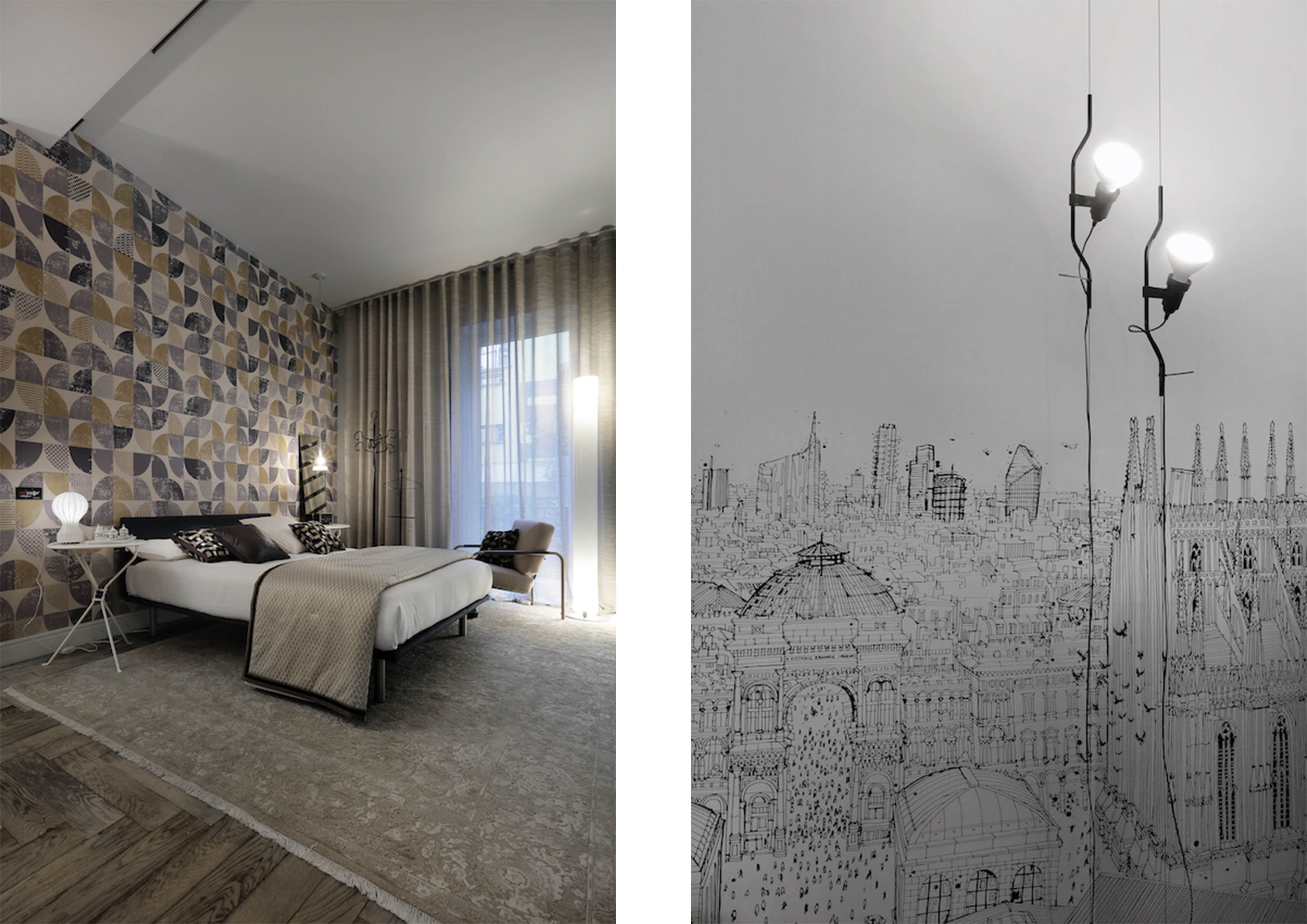
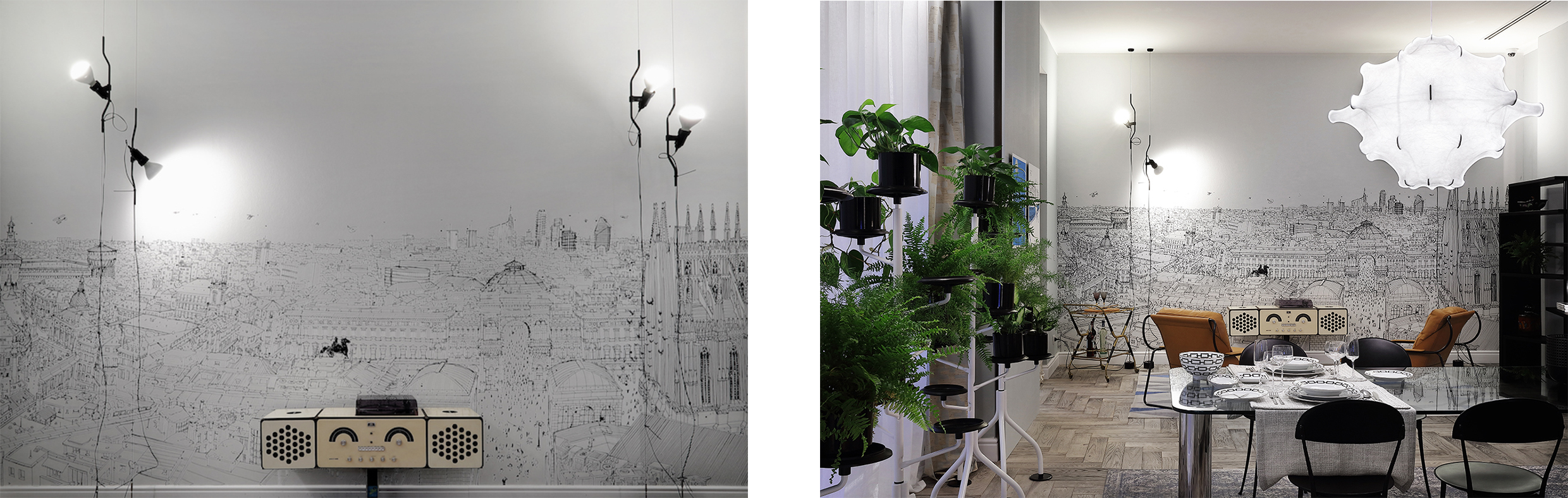
Una dichiarazione d’amore alla città di Milano, al suo stile e alla sua storia: il progetto culturale ed espositivo di Zanotta e Salvioni Milano Durini è stato inaugurato recentemente e racconta una storia intima, uno sguardo sugli interni del capoluogo meneghino, una dedica a chi la vive e l’ha vissuta.


wallpepper


Il secondo piano dello showroom Salvioni si trasforma così in un appartamento senza tempo e sempre attuale,  dove gli arredi curati da Zanotta dialogano con le opere di Carlo Stanga rappresentanti diverse prospettive della città: le opere Fine-Art montate su dibond, sono state stampate con qualità e competenza da Spazio 81 mentre una grande, magnifica visione di Milano, una delle opere più iconiche dell’autore, è stampata su carta da parati WallPepper®TNT arredando la zona living con una risoluzione eccezionale ed assolutamente fedele. 


wallpepper


WallPepper® per l’occasione ha inoltre presentato grafiche a catalogo in una nuova versione, in armonia con quell’emozione unica che vale la pena guardare con i propri occhi.

Partners news

Archipalette da 110 e lode

Il colore è un elemento essenziale per esprimere se stessi e il proprio stile, anche in casa o in ufficio. Oltre a rendere gli spazi più confortevoli e stimolanti, l’uso sapiente delle scelte cromatiche all’interno degli ambienti è fondamentale per modificare la percezione di luminosità e dimensione degli spazi, assumendo quindi un carattere non solo estetico, ma anche funzionale. 
Specializzata in vernici e soluzioni per la decorazione d’interni, Cap Arreghini lancia Archipalette, un nuovo progetto a supporto dei professionisti del colore, architetti e interior designer.


INFINITE COMBINAZIONI

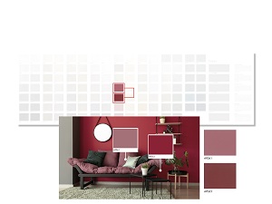
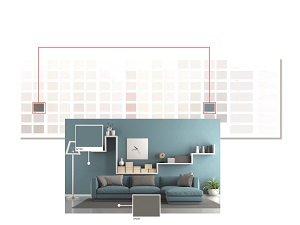
Archipalette si presenta in una selezione di 110 tinte, classificate con cura in una scala composta da tinte neutre e classiche e da toni profondi e desaturati, in perfetta sintonia con gli stili dell’interior design più attuali. L’uso di toni diversi si basa su tre principali schemi di colore: monocromatico, coordinato e di contrasto. 

Archipalette AP054-AP050

INFINITE COMBINAZIONI

L’azienda, specializzata in vernici e soluzioni per la decorazione, lancia un nuovo progetto a supporto dei professionisti del colore, architetti e interior designer. Comprende oltre un centinaio di tinte, classificate in una scala studiata ad hoc per gli ambienti interni questo modo è possibile creare infinite combinazioni gradevoli e versatili, in grado di generare emozioni. Con Archipalette, Cap Arreghini rafforza la sua posizione a fianco dei professionisti del design e della decorazione, garantendo uno sviluppo costante della propria gamma prodotti per soddisfare le esigenze contemporanee dell’interior design.


DUE DIVERSE LETTURE

Ma come si legge Archipalette? Ogni colonna della palette rappresenta un piano tinta sino ad arrivare a 110 colorazioni derivate. Per creare gli abbinamenti è possibile scegliere due colori della stessa colonna, ottenendo un abbinamento tono su tono (lettura verticale), oppure scegliere colori nella stessa riga ottenendo armonici contrasti cromatici (lettura orizzontale).

Archipalette lettura orizzontale                             Archipalette lettura verticale

Le 110 tinte contenute in Archipalette sono riproducibili con gli smalti murali della linea K81 e con le idropitture da interno della linea Ecolora di Cap Arreghini.


Sfoglia il catalogo per scoprire la gamma


Partners news

Metal Art on Stage. Planium Excellence in 4 Finishes

Four classic Planium finishes, protagonists of this scenario.


Four large metal plates to represent the Planium Textures: Brushed Copper Planium is the first of the finishes on display not to be forgotten, if we consider that brushing gives the metal the quality of shine and color, which is precisely copper, and you can see the swirling waves typical of the brushing; where instead the satin finish adjusts in a more orderly sense the second of the four plates, a cold, elegant, vertical, slightly hieratic Stainless Steel, wonderful in the contrast with the background; Canvas, that is the double satin finish, makes the third foil a real cult object, Brass: like a precious woven fabric with an ancient character, further enhanced by a golden color. Brass, which in itself has a green note inside that makes it "cold" compared to gold, thanks to the double satin finish acquires a more elaborate and warm color, less bright but more welcoming.

To complete the idyll, and somehow to close it, Calamine on the right naturally lends itself to an already artistic conception. Why? For a combination of colors that generates an iridescent tint, changeable over time, which occurs spontaneously in it. The dominion of Blue as of Anthracite, however, leaves room for the Air Force Blue, even a Magenta background perceptible in some points: a varied and "complex" metal, to be discovered with a careful look ...

Partners news

Ceramic mortar becomes surfaces. Innovation and design

Ceramic fiber reinforced mortar covers the walls indoor and outdoor. 3D surface

This is one of the news presented at Made Expo by the Florentine company 3D Surface: a new collection with a refined design, developed with the use of special fused material.

3D surface

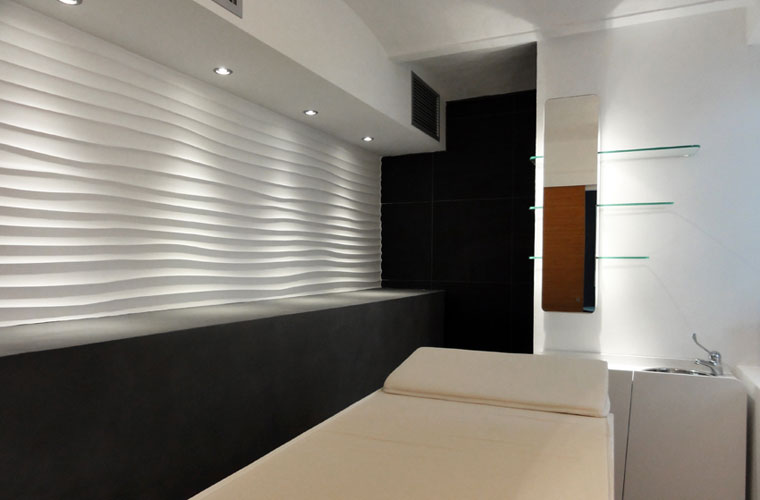
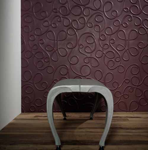
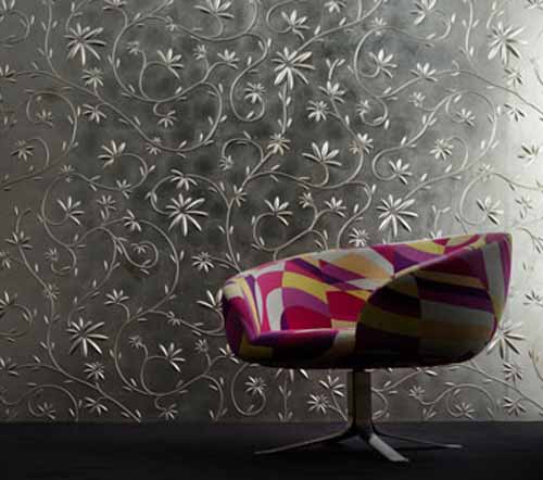
There are thirteen decorative textures with an organic and refined design, composed of elements that interact with each other. At the fair, inside the exhibition architecture workshop, touching the new "wall sculpture" became possible. The surfaces come alive, walls change their skin and transform.

3D surface

This is an innovation in the usual coating scenario. Architects, designers and planners have in their hands a versatile material that allows them to conceive new solutions, leveraging the tactile and sculptural quality of these textures.

3D surface

These materials also provide continuous solutions, surfaces are uninterrupted. It is an interesting change that combines innovation, research and design.   www.3dsurface.it

Materials

Kids Design Manifesto

Finally available to the public, on Amazon, the Kids Design Manifesto, the first international manifesto - presented in Italian, English, and Chinese - for all those who are really interested in the kids' world innovation.

The Manifesto, first and unique of its kind, is the result of a long and intense research work coordinated by CILAB - Creative Industries LAB within Politecnico di Milano, Design Department, since 2015, with contributions by Francesco Schianchi, Luca Fois, Arianna Vignati e Francesco Zurlo and the patronage of ASSOGIOCATTOLI.

The Kids Design Manifesto intends to be the cultural foundation of an international movement we called KIDNASCIMENTO (kid renaissance): a research and design approach that places the Kid at the center, as a person with his rights, as written in the Declaration of the Rights of the Child drafted by the League of Nations in 1923.

Design, as a multidisciplinary profession, is the most appropriate project culture and method to deal with "products and services" for kids.

Kids' products and services are, by nature, “systemic” as they convey emotional, cognitive, relational functions, other than their function use.

So, a toy is not just a medium of entertainment, but, as an Assogiocattoli's payoff claims, it is "food for the mind".

Especially in the first 1000 days of a kids' life, including the months of gestation, each sensorial experience contributes to the construction of the first and fundamental neural patterns which will determine their grown-up character.

Hence the strategic importance of the "Kids Design", to grow up conscious and independent kids, characteristics of freedom.


The Network of The Manifesto’s Ambassadors

The Ambassadors are all those who, after reading and sharing the values of the Manifesto, want to enter its network and participate in the research and the discourse of the Kids Design, organizing meetings, activities, and workshops to broaden and empower the Kidnascimento movement and to positively inform and push professionals, companies and institutions towards the most strategic social sector, the kids' one.


For those interested in becoming part of the network, contact [email protected].

Partners news

The “Building that Grows” in Montpellier

20 February 2019

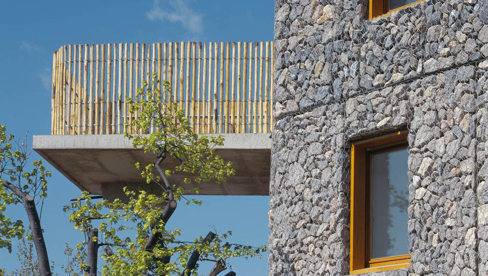
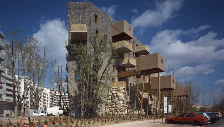
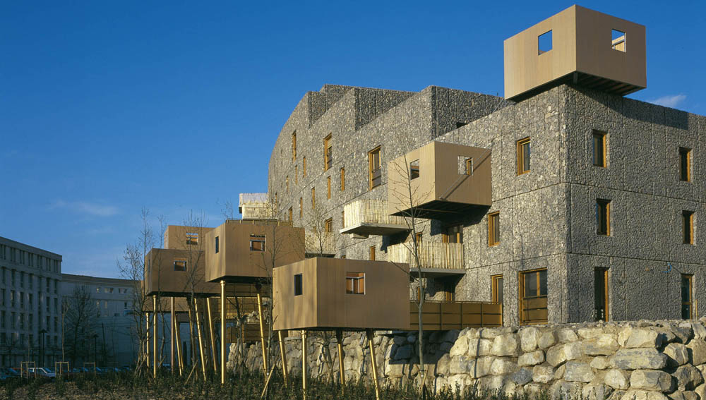
It's called the Building that Grows, and it could be compared to a dream, a wish that comes true. It's something different, which we are not accustomed to, it is extremely material but at the same time loaded with symbolic meanings. building that growsWe are in Montpellier, southern France. The Edouard François’ Maison thinks and designs this building for houses that will become part of the collections of the Pompidou Centre. The Maison architecture reflects the trends of contemporary society: sustainable development, the use of local materials as well as the conservation and valorisation of the existing buildings. These are all recurring themes in the work of the French firm that continues to investigate new forms of sustainability, new "green" habitat.

SLIDE building that grows

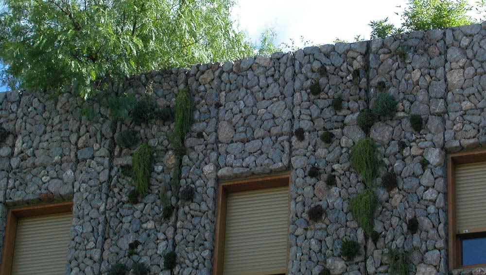
In this case, the choice was towards the use of stones as wall claddings and to design balconies or small wooden terraces that sprout from the sides of the building by discontinuing the linearity. The study of the balconies was a key part of the project: we are the "balcony-gardens" to dine outdoors and to accommodate many friends; the "balconies-cabins" that remain perched in the trees for more intimate gatherings, then the "balconies-towers" that, as little medieval towers, allow you to explore your surroundings, the foliage of the tree tops, in which the building is well integrated. Finally, there are the "balcony-terraces" entirely dedicated to reflection and contemplation to live in perfect harmony with nature while staying in town. building that growsThe name of the building, however, is tied to the outside walls. As a living skin, a real intervention of manipulation was built by François Maison. With the idea that it would grow and sprout, that the building would slowly change its appearance according to the laws of nature, sacks of potting soil, stones and small plants were combined with iron cables as support. Some climbers have watered with compost and planted along the surface, until the installation of an automatic sprinkler system on the façade. Just like a small eco-system, the Building that Grows continues to change and to change depending on the form you create, mosses and plants that grow and then die, creating a constantly evolving composition. building that grows www.edouardfrancois.com 

Carlo Bardelli

Green building

Flou

Salone del mobile Milano

09/14 - 04 - 2019

BRIGHT EXPERIENCE

Reviewing interior design in relation to light: and light is the leitmotif of the latest Flou 2019 developments. Delicate and oneiric, it is a light that defines the spaces and marks the transition from intimate, cozy nocturnal situations to peaceful, joyful daytime atmospheres. A light that satisfies the desire to seek shelter in a reassuring cocoon yet beckons to hospitality, sharing and socializing. In this light, white is the protagonist and, combined with exciting splashes of color, it creates ambiences and situations that express energy, vitality and joy.

Light and color 

A white space interrupted by brush strokes in forest green and pumpkin orange, the basic colors of the 2019 Flou collection. It is not the minimalist stark white of past decades but interprets a new exhibition concept in which the design matrix is clearly identifiable, original and not standardized. This white platform contributes to exalt the intrinsic value of the products, to interrupt the continuous progression of grays and blacks, to balance hues and shades, to enhance the consistency of fabrics and highlight 

the elegance of the details and the finishes: a new, dynamic and surprising ‘bright experience’. The neutral shell frames the furnishing solutions where freshness, vitality and colors create a delightful mood that reflects personalities and allows people to identify with it.

KOI

Design Carlo Colombo

One of the immediately recognizable characteristics of Koi is its simple harmony. Its softness and generous shape are expressed through its name; in Japanese, Koi means loyalty and love, the fundamental principles that inspired my design.

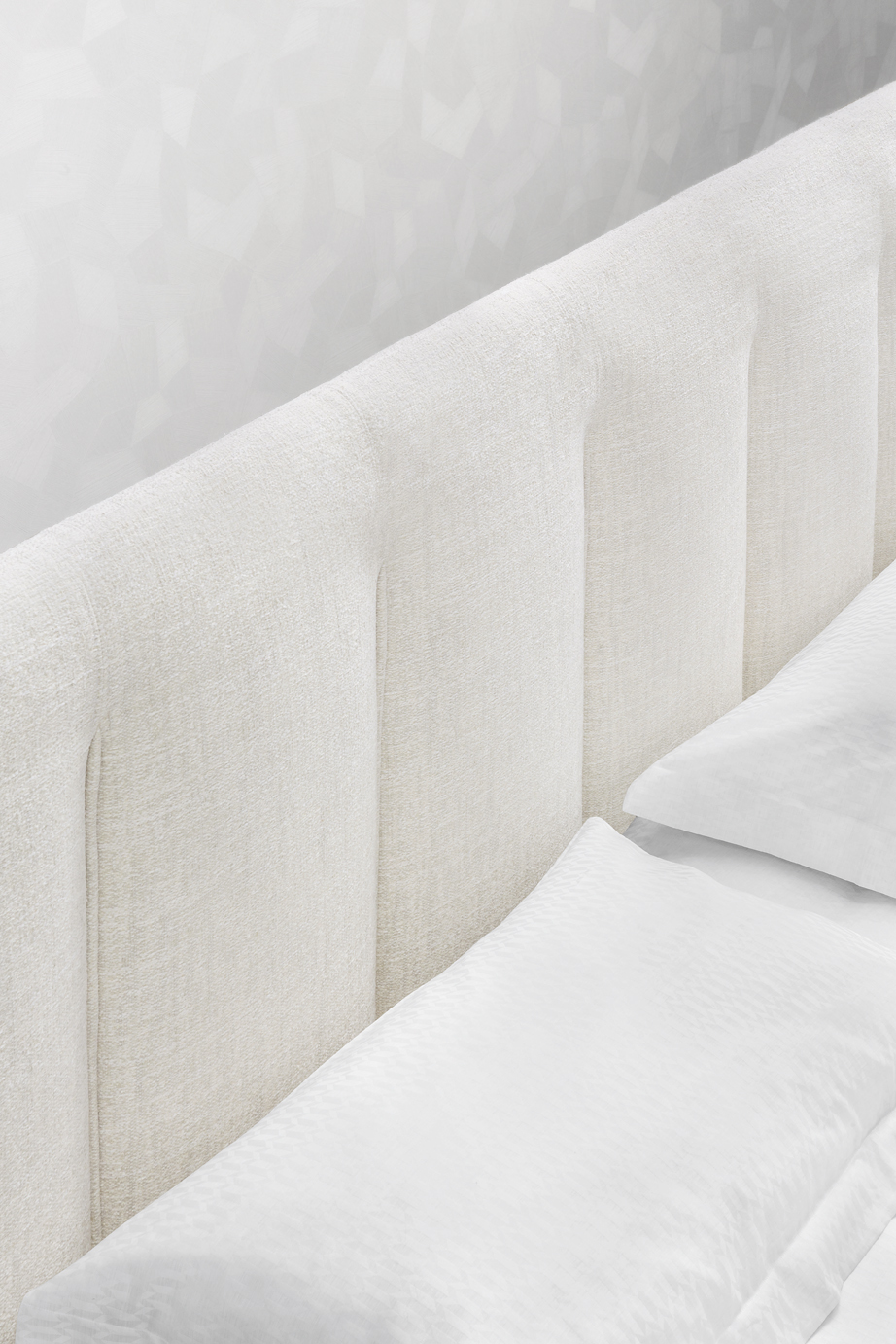
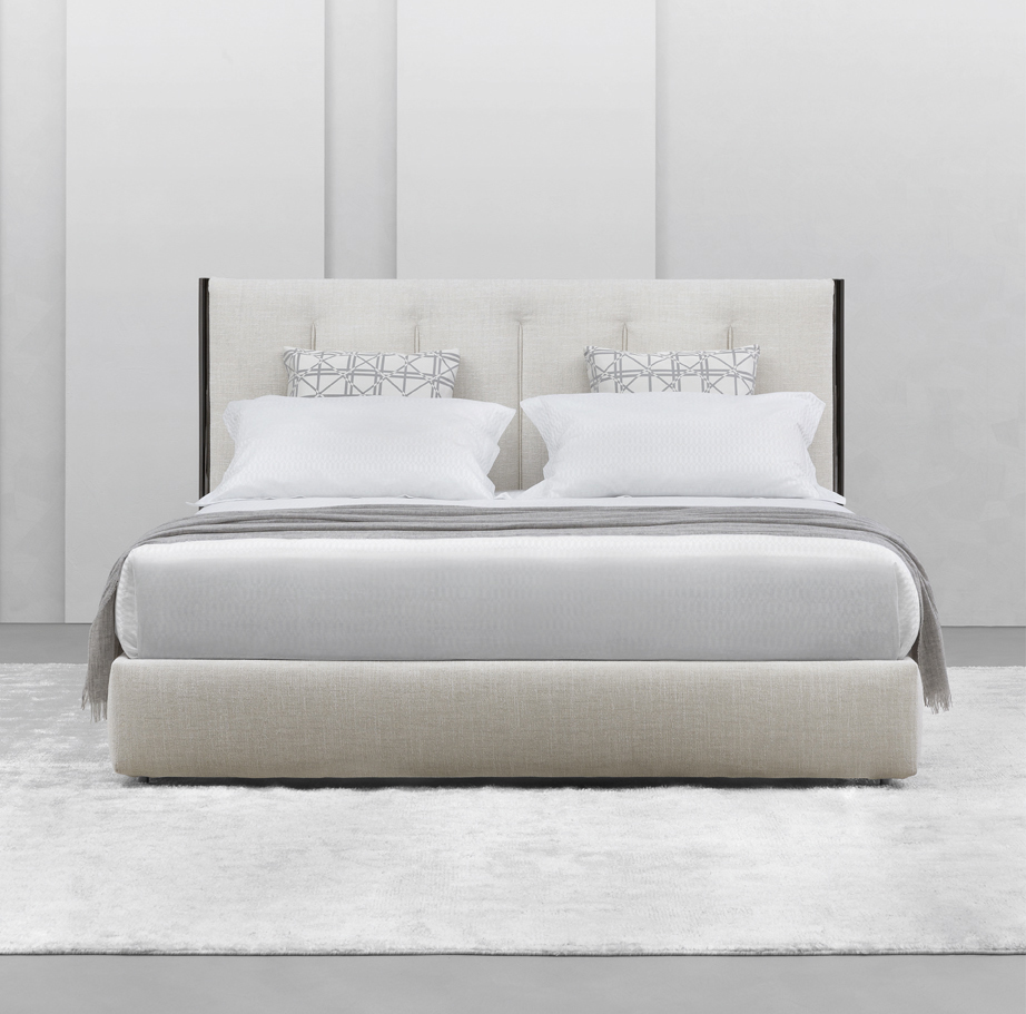
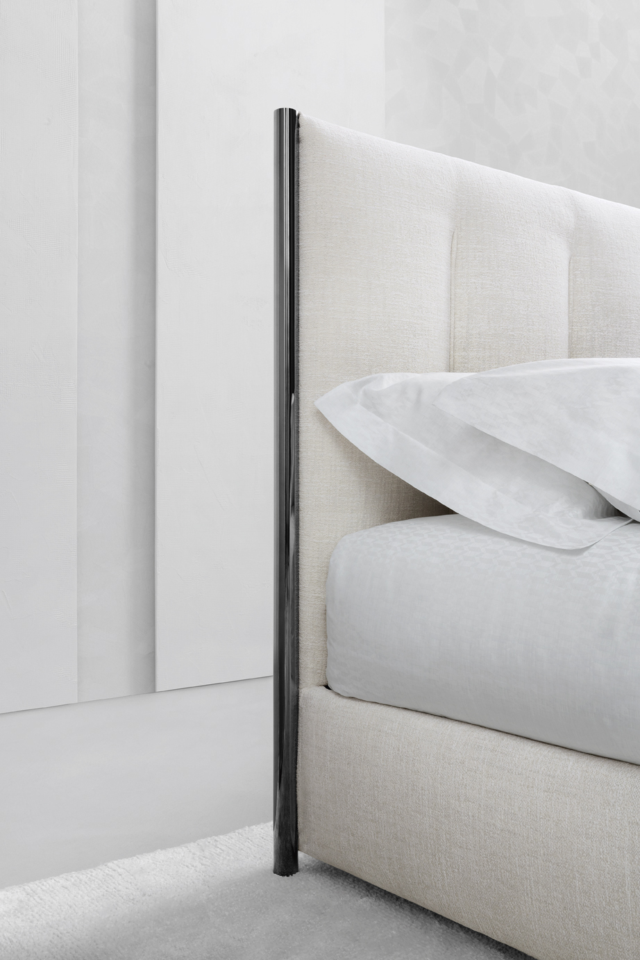
A double-size bed with clean, sharp lines; it immediately suggests the idea of discretely charming, and not ostentatious, luxury. The original and architectonic shape of the headboard, framed by the eye-catching metal structure that continues downwards to form the feet, is softened by the fabrics that have been skillfully stitched with vertical quilting. This decorative addition appears to elongate the bed and contributes to the creation of a design that is welcoming and sophisticated. 

Available in the double-size version; it can be supplied with a slatted base, a storage base, a slatted base with electric movements, and the new base Leonardo. The covers in fabric or leather are completely removable. Decorative details of the headboard are available in polished black nickel or matt burnished.
 

KOI1


 flou KOI 3  flou KOI 2


LEONARDO 

Design flou

The Leonardo System indicates a true ‘change of pace’ in the 40 years of Flou’s sleep culture. It was developed to satisfy the desire to rediscover the value of hand-made items from days gone by, and its strong points are the prestigious craftsmanship and the natural fibers of hemp, horse hair, cotton, cashmere.

A luxury collection, exclusively Made in Italy, that includes four elements – the bed base, the mattress, the top mattress and the pillow. They work in perfect harmony and respond to the need for support, ergonomics and elasticity, while ensuring superior comfort. 

The Leonardo System will be presented in exclusive spaces in the showrooms of authorized retailers. The potential customers can ‘immerse’ themselves in an experience that is emotional, tactile, visual and olfactive, where they will feel they are in a real bedroom – somewhere designed with esthetic beauty, wellness and unequalled comfort being the essential ingredients.


flou leonardo 1

BASE. The structure in fir multilayer and covered in cotton fabric guarantees elasticity. The two upper layers of biconical springs and isolated springs provide support and ergonomics. It can be used with all compatible beds of the Flou range. 

MATTRESS. “100% organic”, it is a masterpiece of crafting and luxury, emphasized by the hand-stitching on the two resting surfaces and on the sides. The ergonomic block – two layers of isolated springs and two of micro-springs – is enclosed in luxurious symmetrical padding on the two sides, in horse hair, cotton, hemp, latex and cashmere. The stratification and volume of the padding have been studied to best satisfy the support requirements for the body weight. Three different degrees of firmness are available: soft, medium, firm. 

TOP MATTRESS. This element does not ‘adjust the mattress’ but is an essential component of the Leonardo system. It is the only one of its kind currently on the market; it has a core of horse hair positioned between two layers of latex. There is a layer of cashmere on one side for the colder winter months and hemp on the other side for the warmer periods and these guarantee maximum comfort in all seasons. Thanks to its hygroscopic properties, hemp makes a major contribution to absorbing sweat and perspiration. Two layers of down (80%) and feather (20%) act as efficient heat regulators, making this bed system a cozy, snuggle-down addition to any home. 

PILLOW. The external covering is coordinated with the mattress cover and is a pied-de-poule fabric, with ‘rat-tail’ trim. The padding in hemp, cashmere and quality down (80% down and 20% feather) ensures sleep with unparalleled comfort.


MYPLACE

Design Emanuela Garbin

When I imagined Myplace, I wanted to give shape to a thought: and the thought was to find in your space – in how you live your space – a place where you could stay and that it could be ‘your place’, somewhere comfortable, cozy, informal. It’s a place where you can find shelter after a heavy day, where you can laugh when watching a film, where you can tell a friend your secrets, be wide-eyed on hearing a piece of gossip, where you can relax and read a book, make love, explore a part of the world without moving an inch.

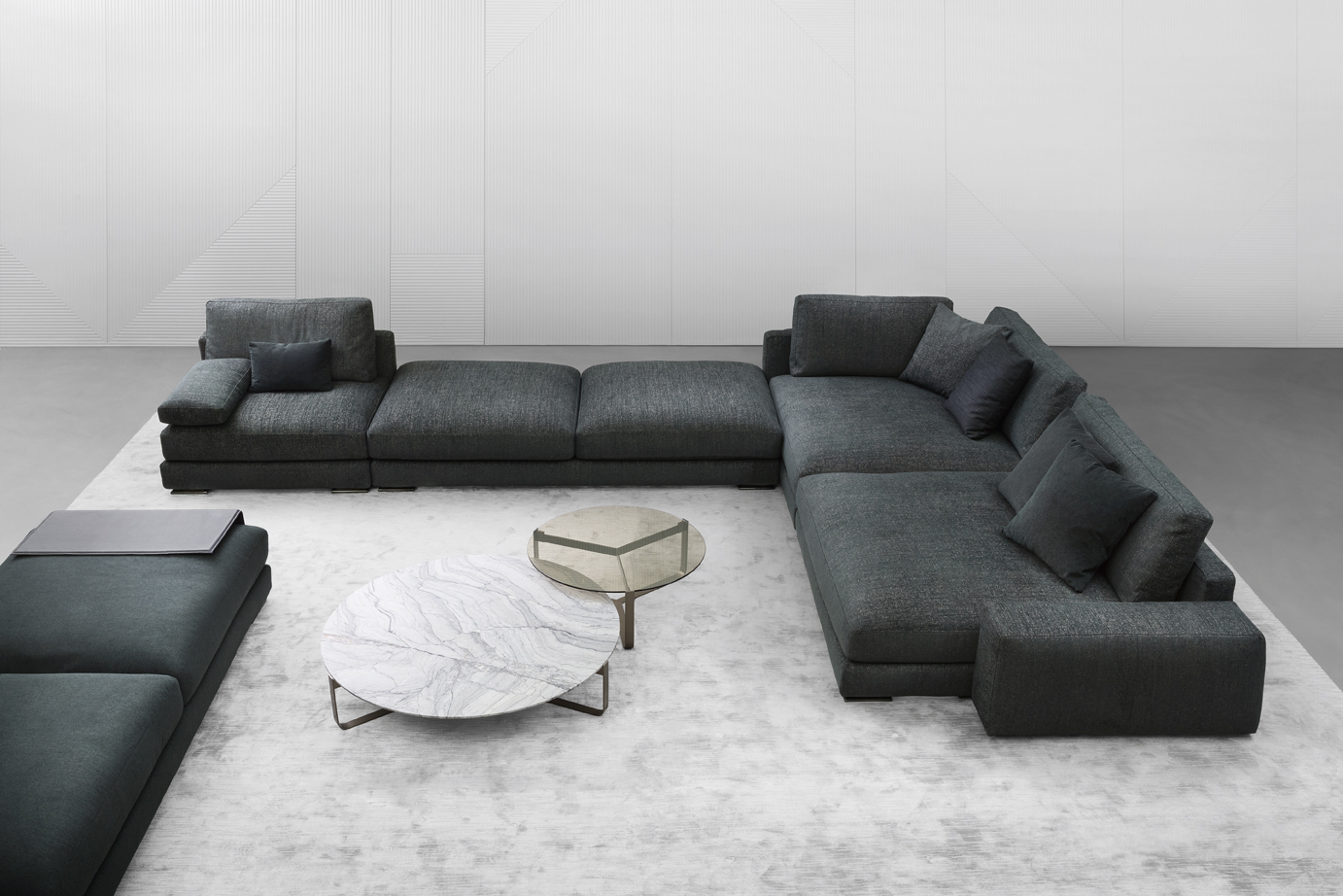
The sofa Myplace is the perfect reflection of the designer’s thoughts: live life with a passion. Three different depths are available to satisfy how everyone relaxes in comfort. The arrangements can be traditional linear sofas, pushed back against a wall, or spread-out like a fan, taking centerstage in the middle of a room. The seats, armrests and backrests – a total of twenty elements - can be arranged freely to create customized units. 

The tops of the Myplace coffee tables are hand-brushed cement and are irregular pentagons or hexagons. They are the perfect accessory to complement the sofa, sliding between the elements and following the curves of the compositions. 

The sofa is supplied with completely removable fabric or leather covers. 

The structure of the coffee table in matt burnished metal or polished black nickel, the top is in the unusual Velasca cement finish, available in the colors: snow white, cement grey and lava black. 
myplace 1


BINARIO

Design Pinuccio Borgonovo

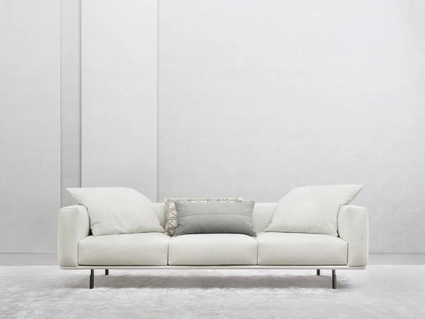
The project is based on the idea of bringing together worlds that differ greatly from our everyday lives, such as the domestic environment and public spaces, combining in a single system concept the respective characteristics and requirements. Serious and functional shapes define the esthetics and the comfort of the product that adapts to the increasingly domestic workplace and to living spaces that are progressively less generous.

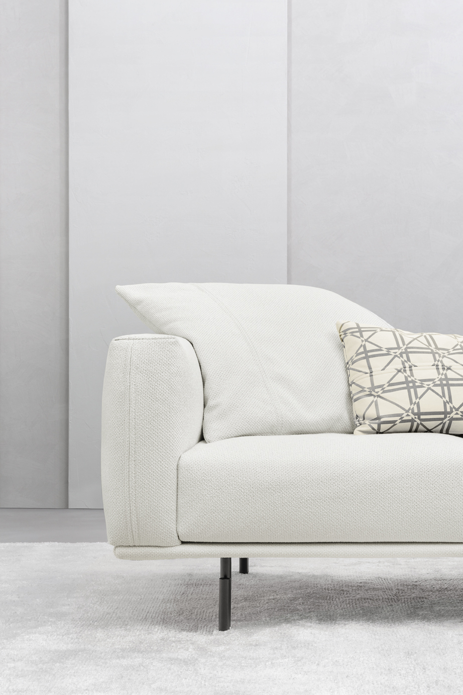
Two- or three-seater linear sofas with noble, reassuring esthetics. The clean, geometric and sharp lines are joined by the light touch of the double feet that raise it from the ground. A moderate seat depth and a compact backrest illustrate the accurate study of the proportions, to guarantee outstanding comfort. 
BINARIO 1

                                             BINARIO2         BINARIO 3


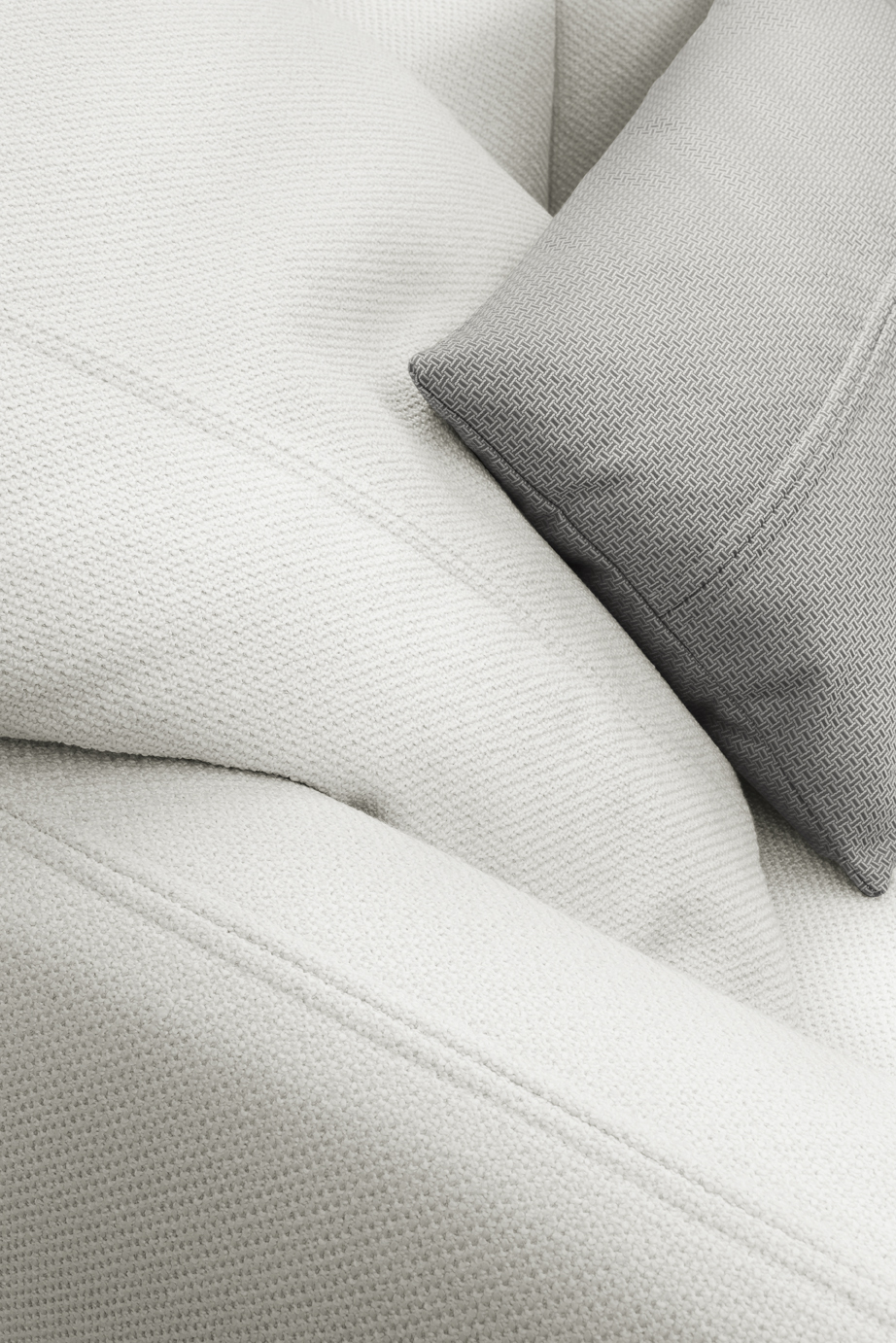
Large feather cushions, that can be scattered randomly, repeat the relief stitching of the sofa’s armrests, giving the composition a distinctive, elegant and contemporary appearance. 

Two-seater (170x85 cm) or three-seater (242x85 cm), available with completely removable leather or fabric covers. The feet are supplied with a matt burnished finish.


NEW BOND

Design Matteo Nunziati
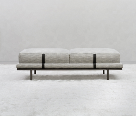
NEWBOND 1The bench designed for Flou developed from the need for a seating unit that was suspended, aerial and that would also exalt the excellence of the company’s processing of fabrics and leathers.

The bench New Bond perfectly complements the bed from the same collection and repeats the distinctive tailor-made qualities. The padded structure rests on cylindrical metal legs and is embellished with cushions decorated by stylish exposed stitching. In the same way as the bed, the structure and cushions are anchored by belts in tone-on-tone leather or in a contrasting color - a design detail to exalt the elegance. 

Completely removable fabric or leather covers. In every version, the belts are in leather. The metal legs have a matt burnished or polished black nickel finish.


Guardaroba 16.32 “Private”

Design Emanuela Garbin

Guardaroba 16.32 is evolving and with Private, it has become more attentive to detail, it takes care of your habits and the outfits in great detail, underlines your dress code, it tidies, it separates.

private1

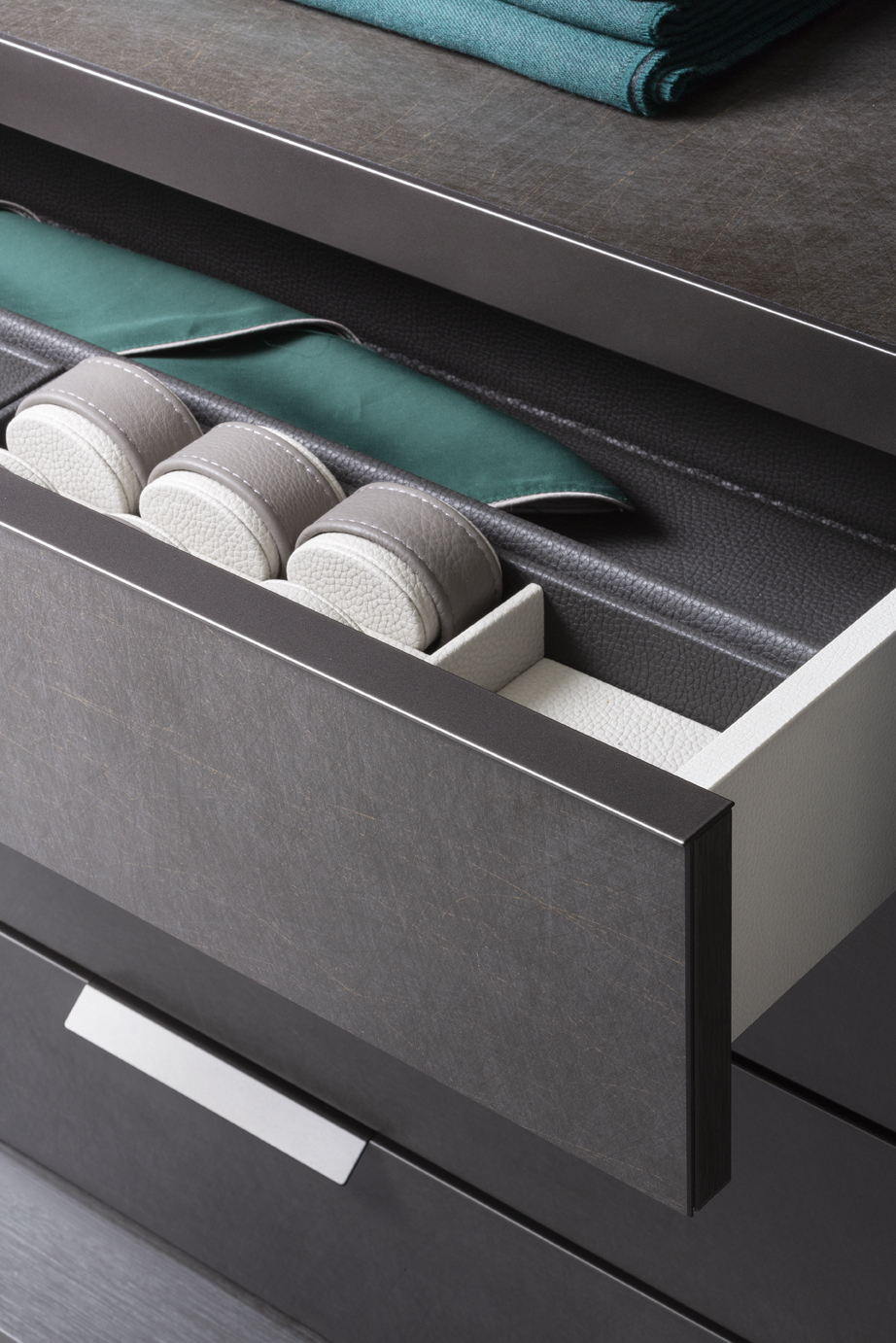
Private, the natural evolution of the Flou wardrobe system, stands out for the luxurious stylish interior design that pays enormous attention to esthetics, for the new methods for anchoring the fixtures, and particularly for the unlimited possibility of personalization. Private consents systematic cataloguing of the wardrobe contents in response to every personal requirement of order and classification. There are two finishes for the interiors: Light, to exalt the fabrics and the colors; Dark, to exalt the garments and the accessories. Rich versions define the drawers, completed with trays, boxes and other containers; shelves and front panels in wood or porcelain stoneware (Concrete and Licorice finishes), and in glass, with or without light fittings, to exalt the contents. The wardrobe Private is completed with two new door options: Pool and Velasca.

Pool door

Cler glass or grey reflecting glass, with a handle that runs the length of the door. flou private 4flou private
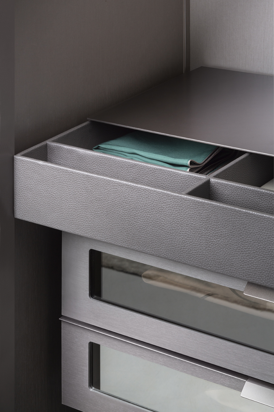
This door protects and screens the garments and accessories, while revealing them discreetly and elegantly.

Close-up of the shelf with pull-out trouser-rack, with a convenient shelf that serves as tray. The top is in porcelain stoneware, Concrete finish. Close-up of the unit with drawers and light, front panels and top in glass; containers in different sizes and dedicated accessories for the drawers ensure order and exalt the contents. 

The interiors of Guardaroba 16.32 Private in the new Light finish, that exalts the colors and the fabrics; they coordinate with the Velasca door in the snow white finish: the hand-brushing of the cement ensures each piece is totally unique and unrepeatable.


Velasca door 

Cement 3 mm thick: this is a resistant, solid material yet it manages to transmit softness. The hand-brushing ensures each Velasca door is totally unique and unrepeatable. Available in three colors: snow white, cement grey, Lava black – it is ideal for people who love clean lines and elegance spiced with a contemporary soul.

velasca

TEXTILE COLLECTION

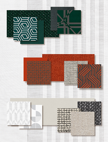
The 2019 textile collection is the creative interpretation of the latest fashionable trends, inspired by the elegance of gentlemen’s fabrics revisited with a contemporary twist. What results is a distinctive, elegant and decorative collection with timeless appeal, that fully reflects the Flou values.

Fabrics that are robust, with good consistency, a strong weave and a powerful appearance; however, they are flowing, soft to touch and they contrast beautifully with the lustrous, brilliant satins. The colors are strong, decisive - pumpkin orange and forest green that contrast with classical white - and, define three distinct color zones, giving rise to a unique and highly seductive scenario. The neutral shades of milky white and charcoal gray reveal new harmonies; strong colors mixed with white are original and fresh; satins have been softened by macro and micro geometries that create particularly attractive effects. 
tessile

The important weaves – Prince of Wales checks and macro geometries inspired by the raffias of Vienna – entwine with jacquard patterns and micro designs typical of the neckties. 

The sharp, gigantic geometries, softened by macro brush strokes and Toile de Jouy landscapes, also merge into false plain colors, giving rising to more original contrasts.

NATEVO by FLOU

CCCube

Design Carlo Colombo

The elements of CCCube have rational and clean shapes. The structure has been produced as an archetypal container and the base unit creates a product of sophisticated irony, a detail that astonishes and intrigues the observer. Integration of light fittings – the true leitmotif - could not be avoided in a product of the Natevo collection. Light is the protagonist that enhances everything around it.
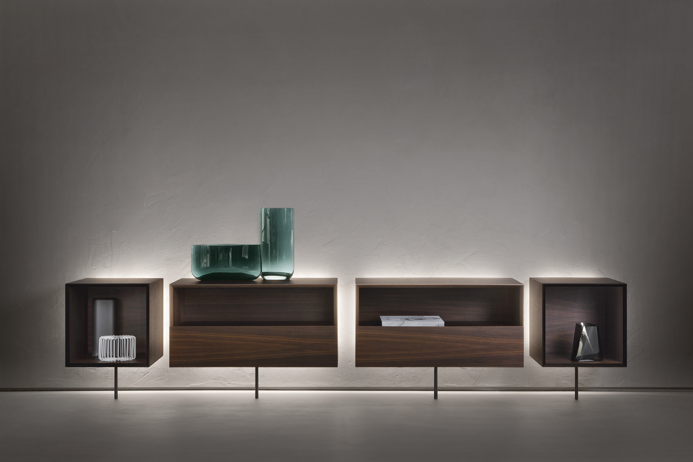
CCCCube

CCCube is a wall-fixed system of modular units that can be used in both the living and sleeping quarters of the home. The units can be fitted with flap doors, drawers or left open to display the contents. They can be used individually or combined as desired to provide infinite versatility of use. The monolithic, geometric appearance is softened by LED lights that illuminate from the side that rests against the wall and from the thin metal leg that supports them, a highly functional detail that adds an enormous esthetic twist. Structure available in coffee-colored or brushed gray oak. 

BABELE

Design Matteo Nunziati

Babele is both a storage unit and a lamp. The shape was inspired by the antique architecture of Yemen. babeleThe idea was the synthesis of a multifunctional architectonic article that was technological yet elegant and timeless.babele2
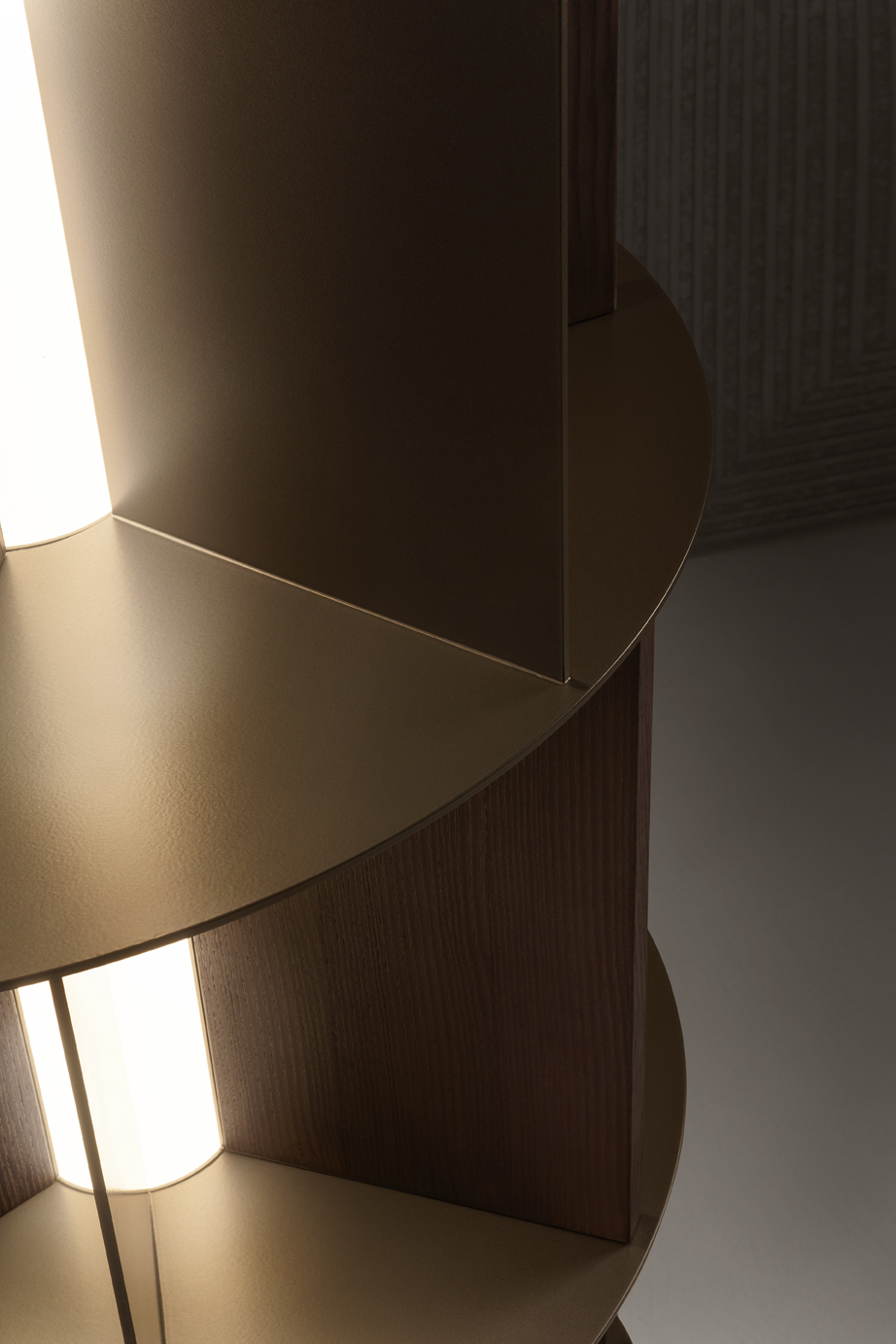
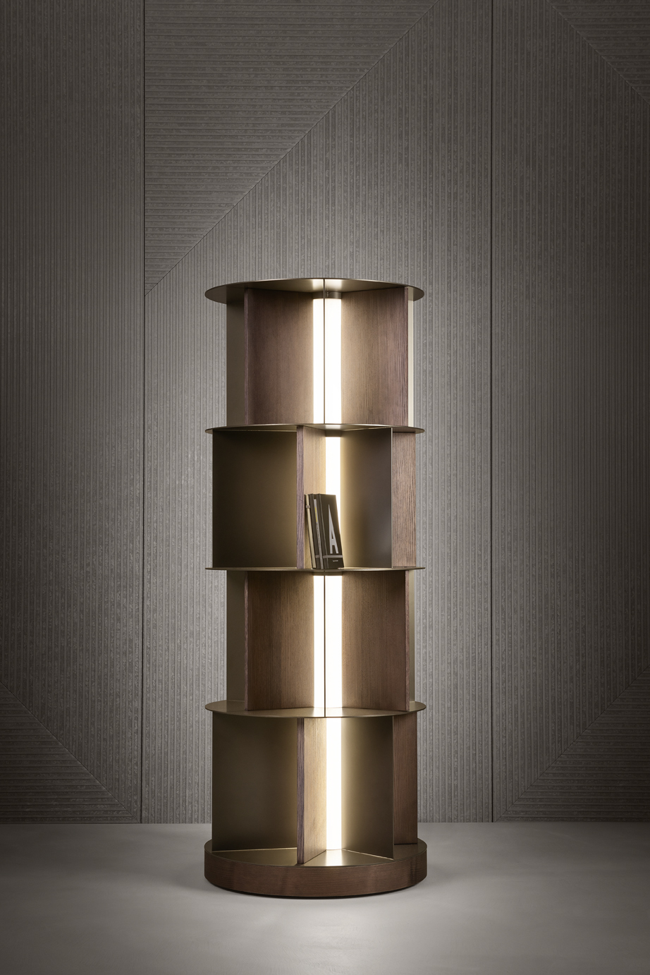
With its pleasantly rounded shape, this swivel bookcase has four horizontal shelves and vertical dividers of different depths, which were designed to store books, vases and favorite ornaments. The structure in metal and wood incorporates a central column fitted with LED lights, which, in addition to providing light, acts as the ‘axis of rotation’. Babele has apparently simple lines yet is extremely sophisticated; it is a precious furnishing accessory produced using special processes, avantgarde manufacturing techniques and with details studied to guarantee its stability.

 Structure in metal, in two finishes: anodic bronze or matt burnished, and in coffee-colored oak or brushed grey. The LED lamp can be switched on using a switch, a remote control, or with Casambi (smart lighting controlled by a smartphone or a tablet).


ASHAA

Design Stefano Bigi

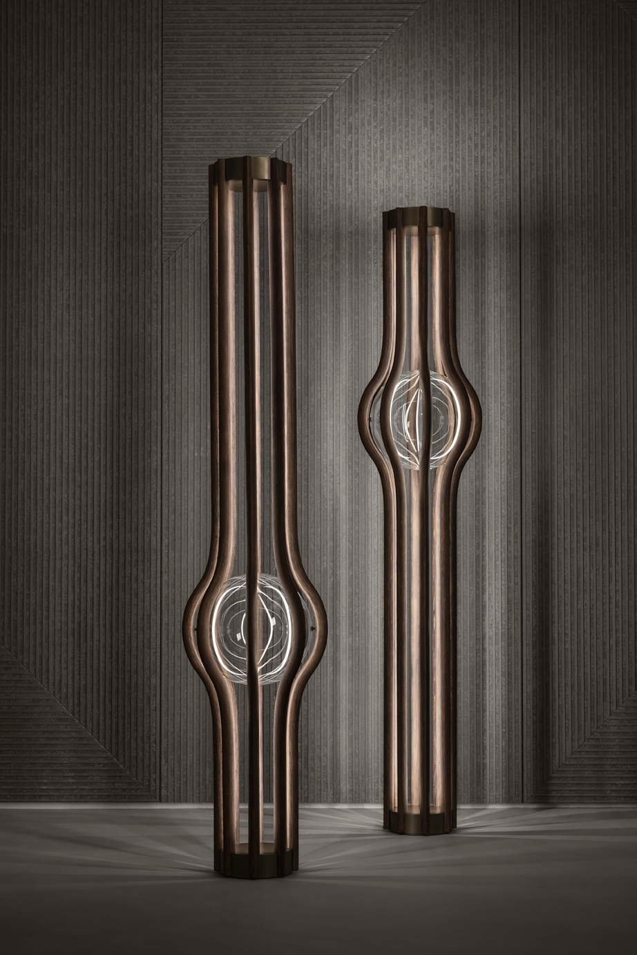
An expression of flowing, delicate shapes, the magic of reflections in its spherical heart. The unexpected meeting of poetry and sculpture, created from wood, glass and light.

The standard lamp Ashaa is extremely eye-catching and makes a strong furnishing statement. The structure is formed by eight slim slats in curved wood; it extends upwards, surrounds and supports in the central part a crystal ball. The LED strips, inserted in the wooden slats and in the metal top, interact with the crystal to create magical and surprising lighting effects. 

 Available in coffee-colored oak or brushed grey; the sphere is clear, smoked or bronzed crystal glass. It is available in two heights: 193 cm and 245 cm, the latter is fitted with a telescopic metal tip for ceiling fitting. The lamp can be switched on using a foot pedal or with Casambi (smart lighting controlled by a smartphone or a tablet).
ashaa

BRISCOLA

Design Pinuccio Borgonovo

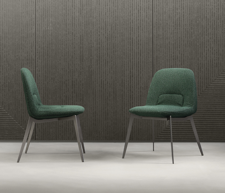
The quest for a shape that immediately translates into the sensation of comfort, exploiting important dimensions and emphasizing the clear references to the past.
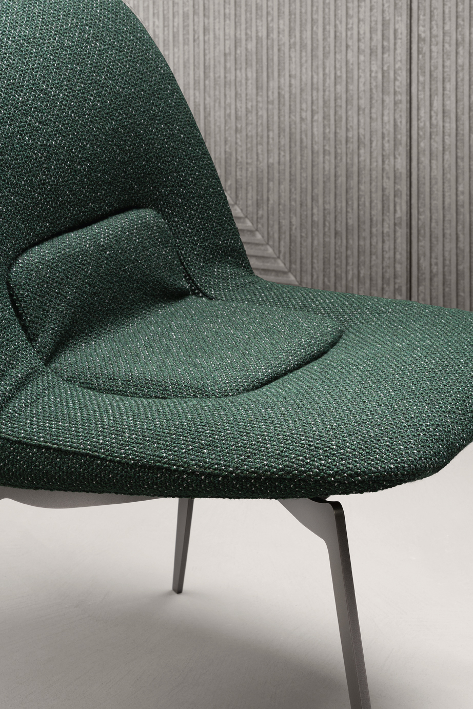
BRISCOLAThanks to its sinuous shape, the chair Briscola beautifully complements any type of table. Comfort is guaranteed by the base and the backrest, consisting of a single foamed shell that matches any style. The pleasantly rounded lines contrast with the sharp cut of the upholstery, creating a stylish chair that was unmistakably inspired by the world of automobiles. Tailored details soften the sharpness of the metal structure. 

The cover of the backrest and seat in fabric or leather is completely removable. The metal structure is available with a matt burnished, anodic bronze and matt greige finish.
briscola 2
Partners news

The LB Open house 2019 has come to the end: 250 visitors, 100 different companies.

31st October 2019

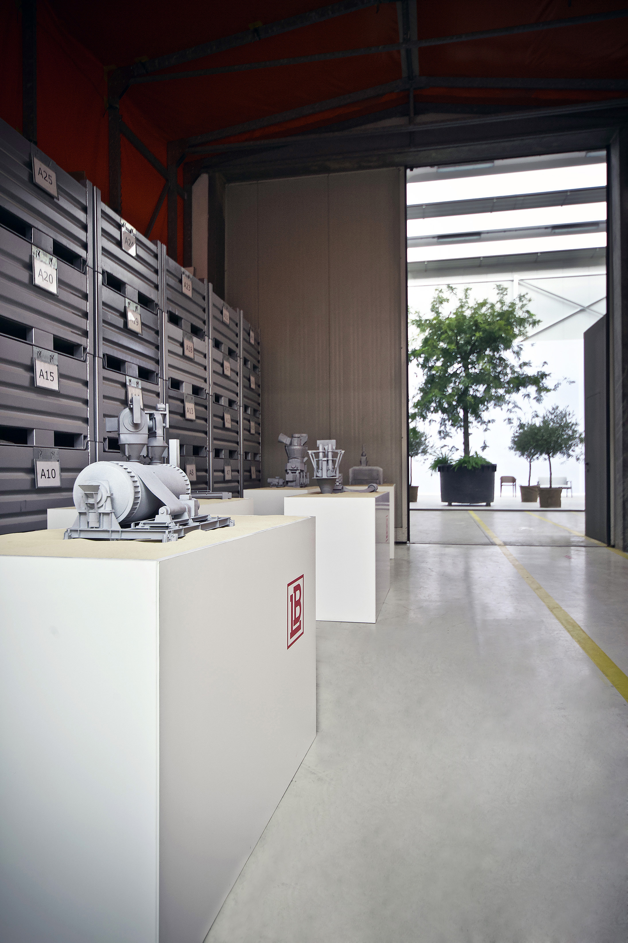
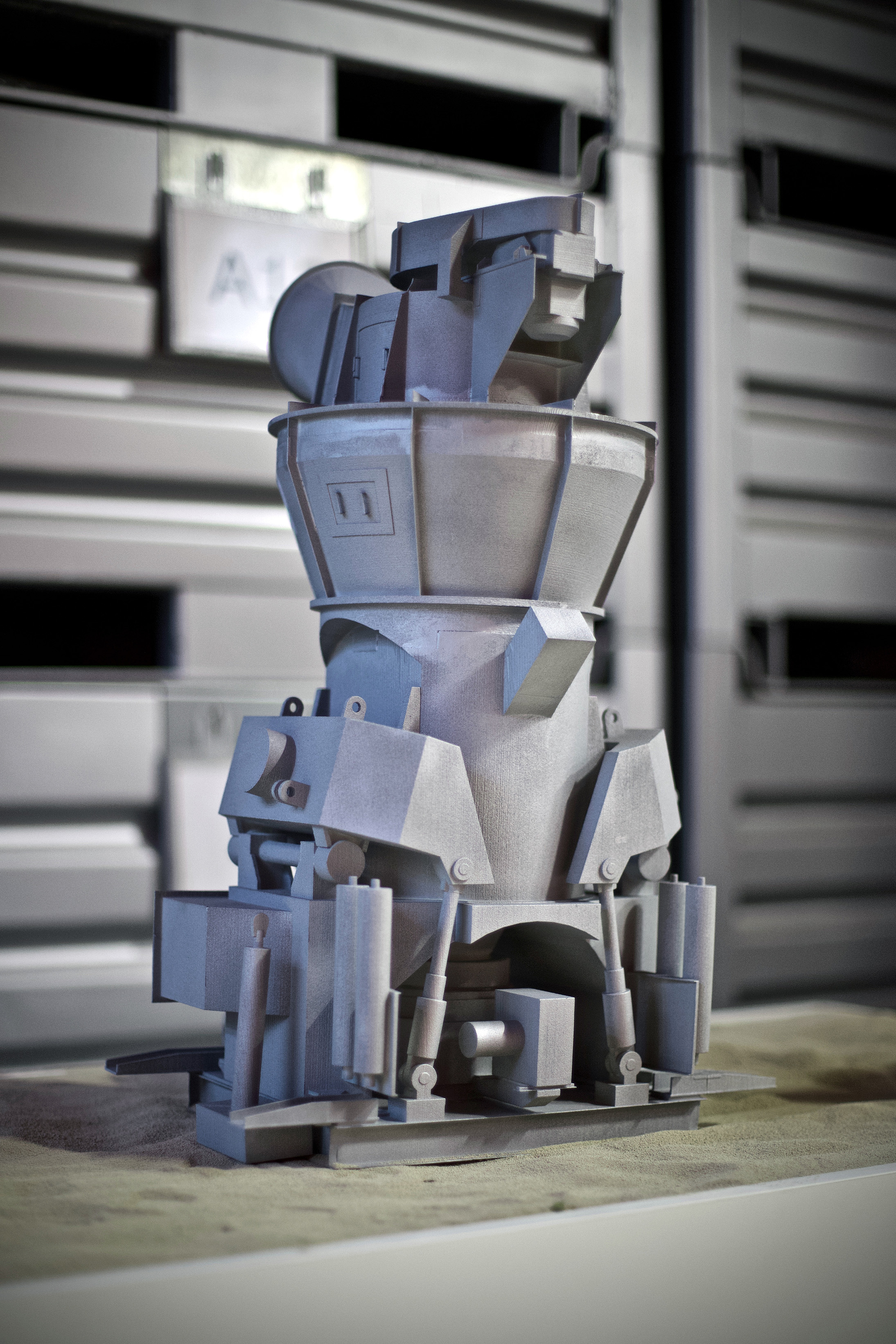
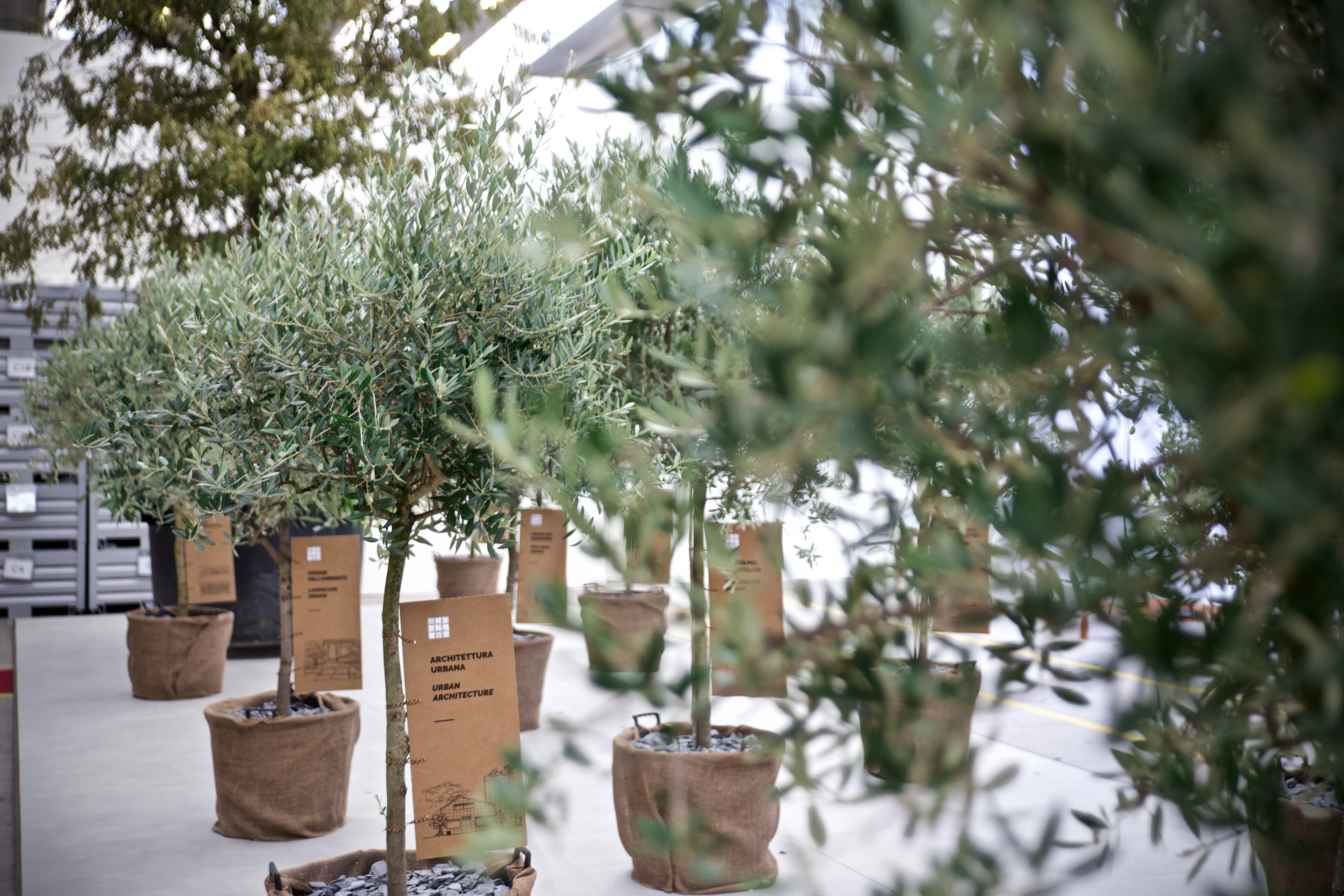
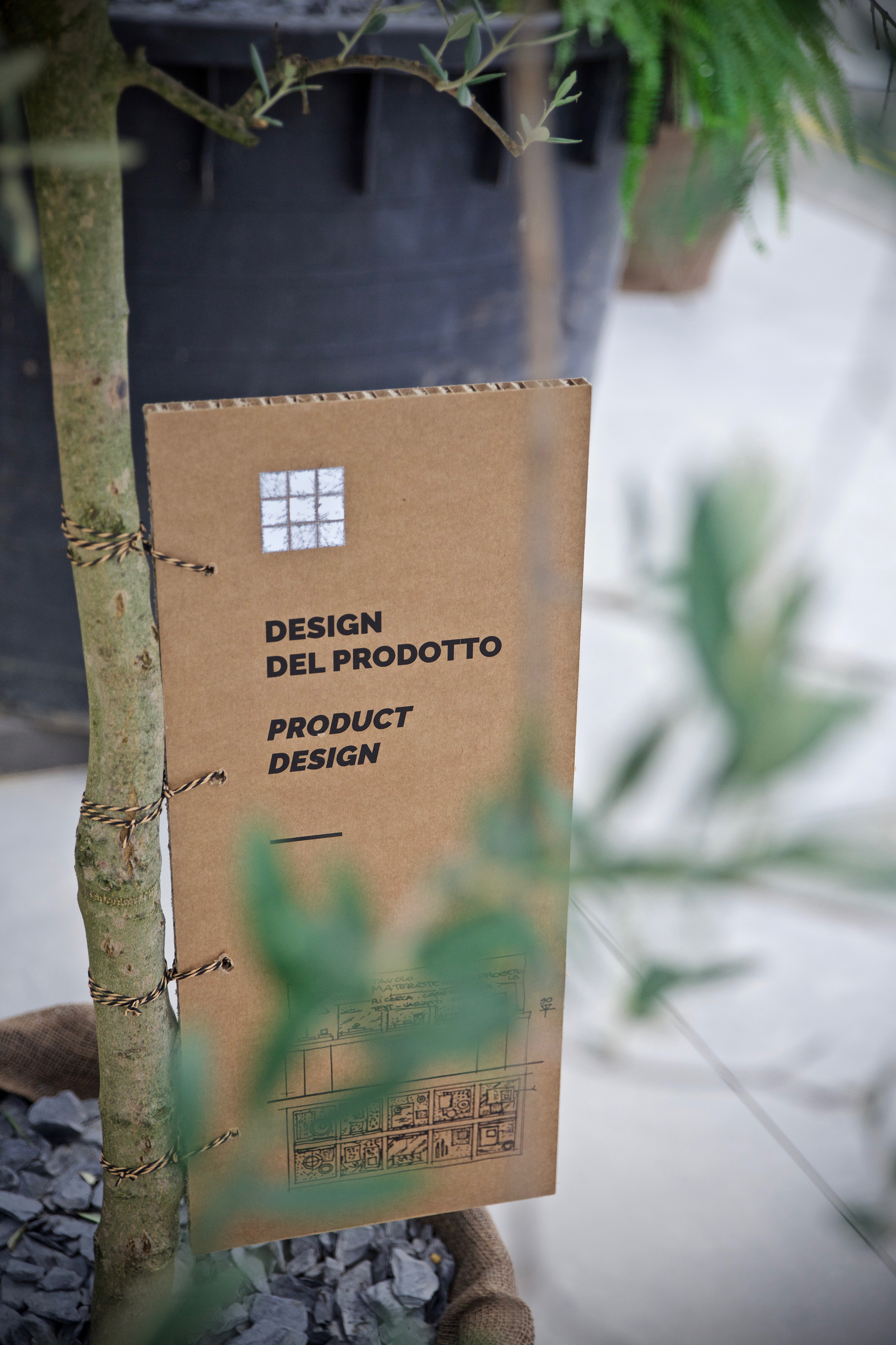
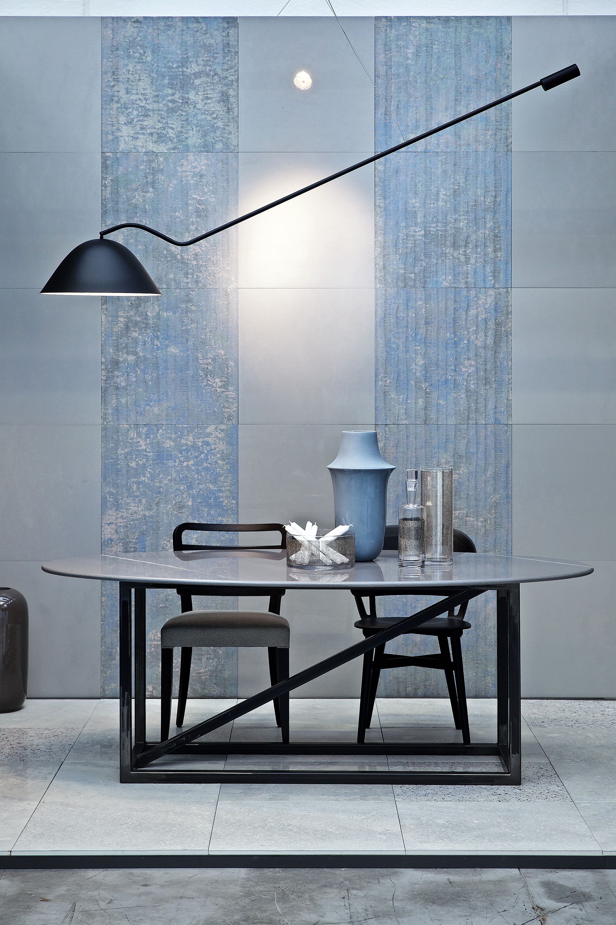
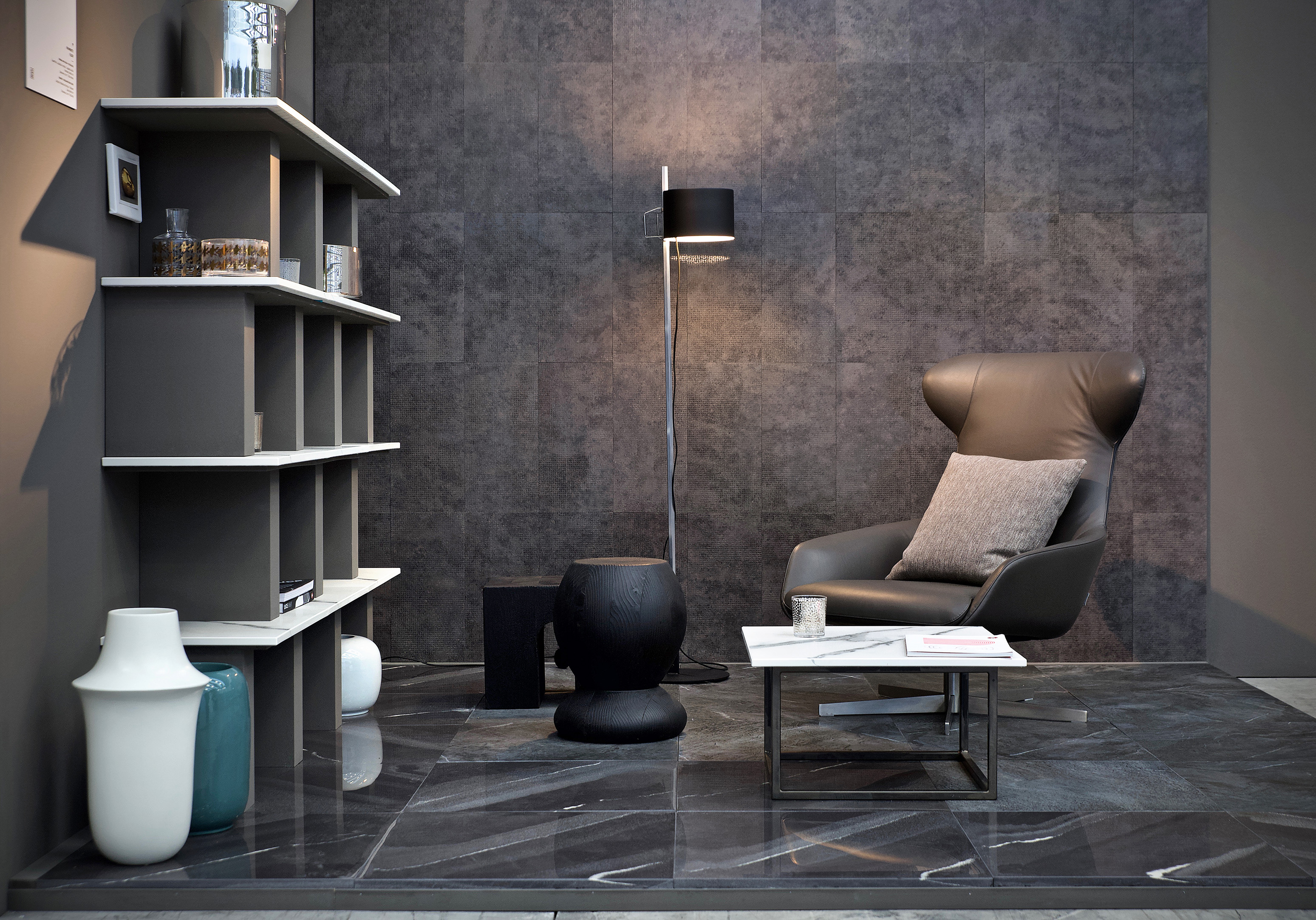
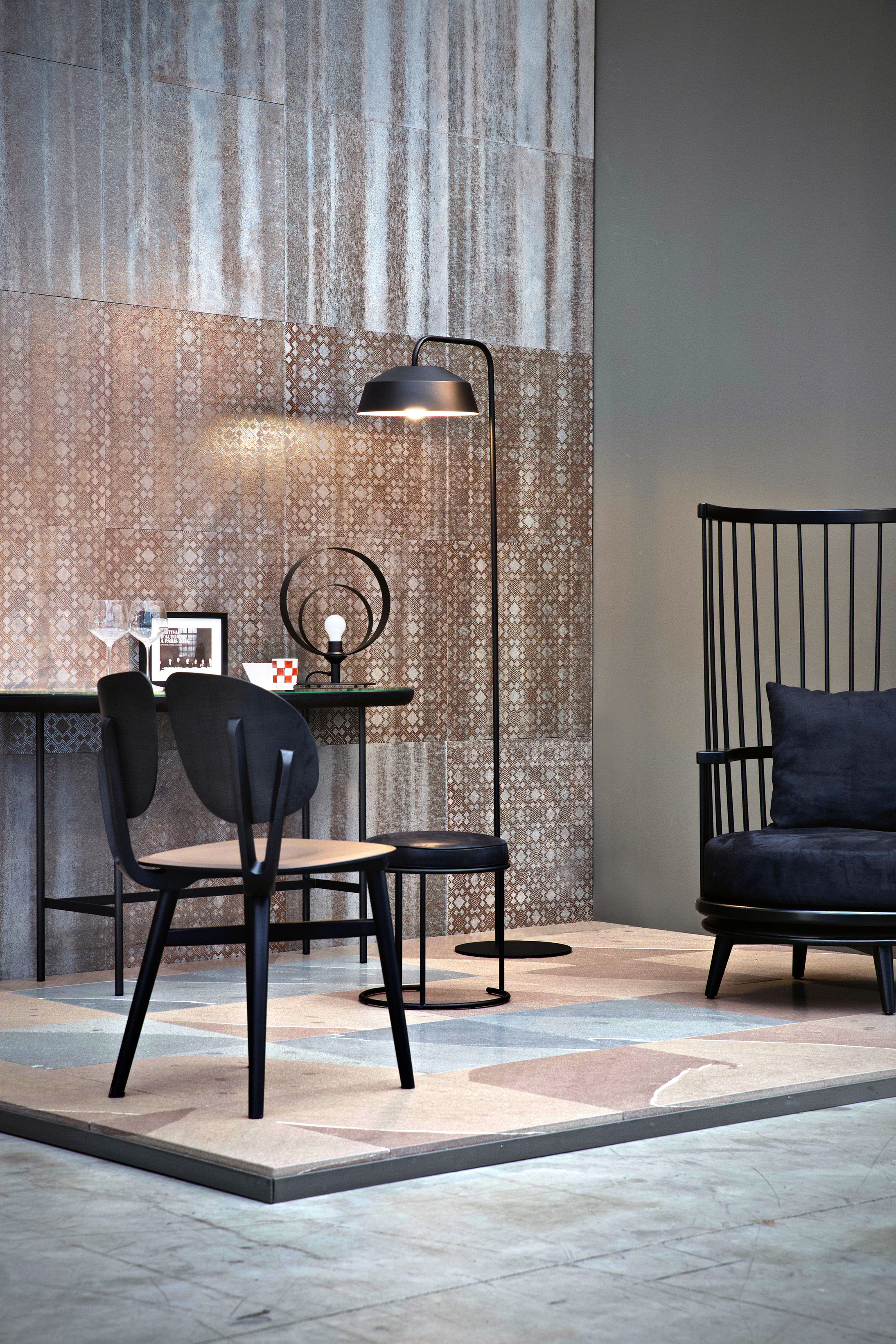
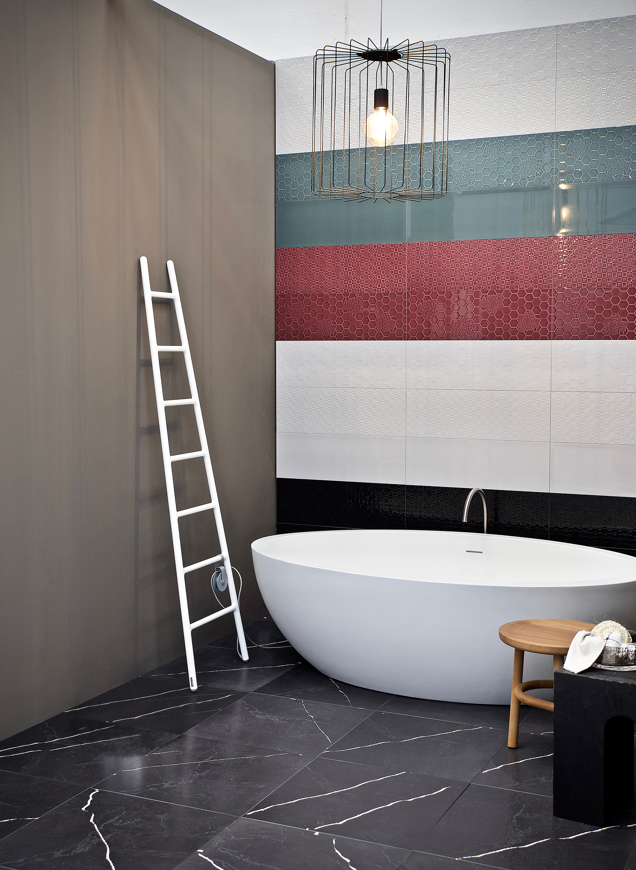
From September 20th to October 4th 2019, LB opened its headquarters to an event focused on circular economy and on the exhibition of the results of the R&D activities on new technologies as well as on finished product. The new collections of technical porcelain gres, available in different shapes, from the 10x10 sample to the large 3200x1600 mm slab, have been exhibited in settings designed by Arch. Marta Meda, that interested parties can still visit by appointment as part of the permanent LB installation.
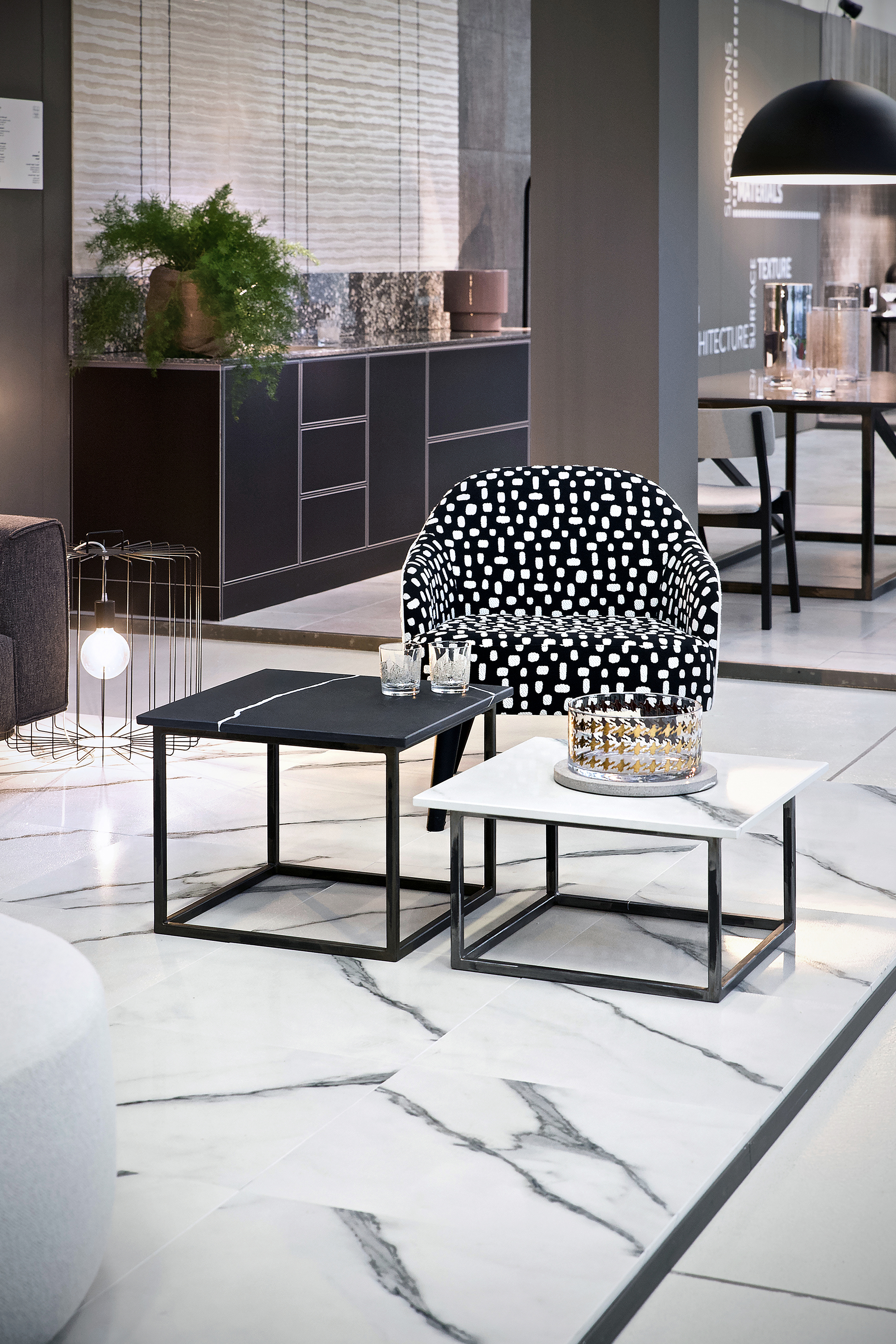
Foto 1


Foto2
The technologica-emotional path celebrate the technological quality of the company, which is today a world leader in the ceramic industry.

 Foto 3

Foto 4
The Wood of Opportunities, An overview of the many application opportunities offered by the LB products, as a demonstration of their high adaptability to different aesthetical and technical needs.


Foto 5


Foto 6


Foto 7


Foto 8


Foto 9
Interior Stories, A journey through five domestic spaces in which the LB material is used for floors, vertical coatings and unique pieces of furniture

Foto 10


Foto 11
LB Materialboard, A selection of LB products available for
designers and creatives.


Foto 12


Foto 13
The Living Room, A comfortable area where discuss, share and deepen topics related to the LB world.


Foto 14


Foto 15
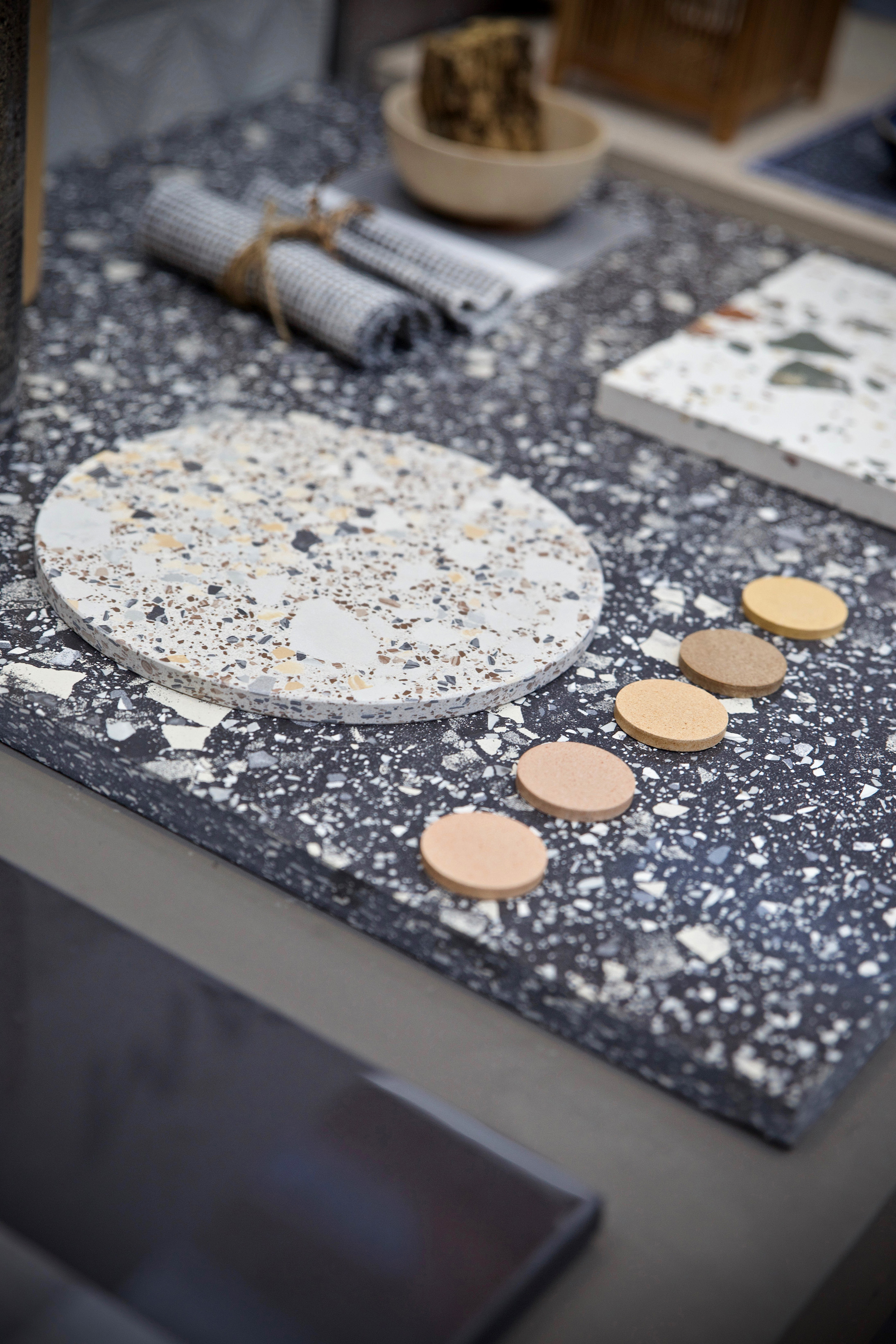
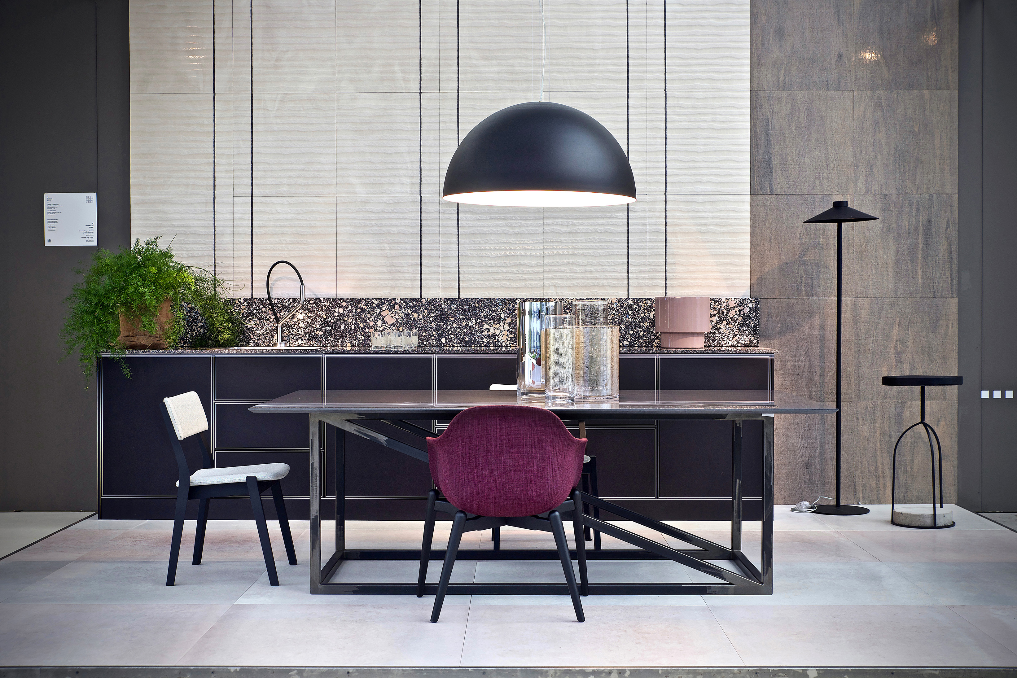
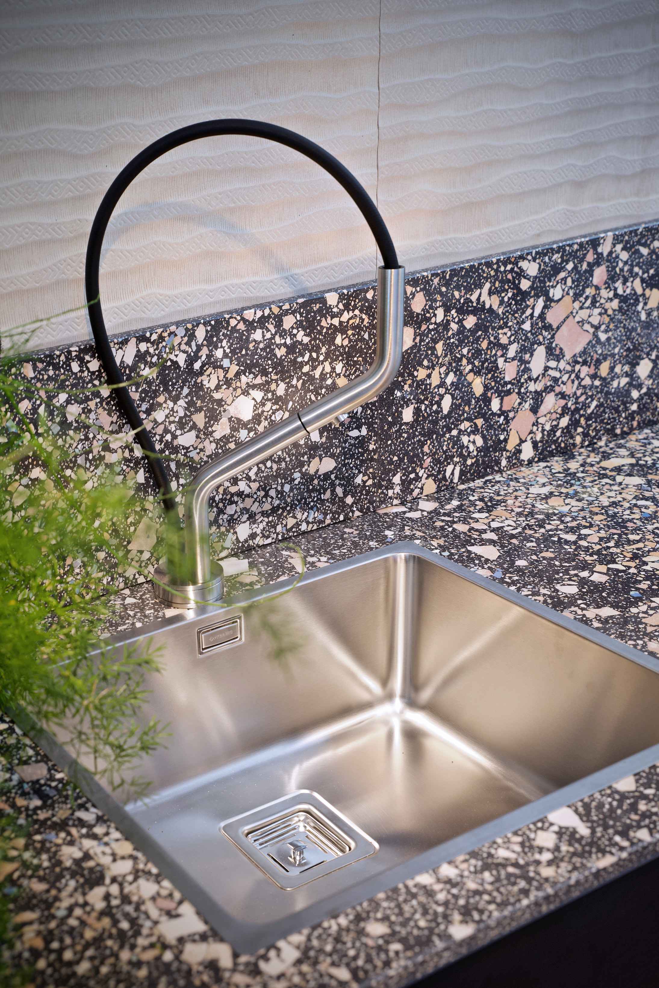
An accurate reproduction of a kitchen and living room together with a pairing proposal between the most trendy LB materials, used for floors, vertical coatings and kitchen top.


Foto 16

Foto 17
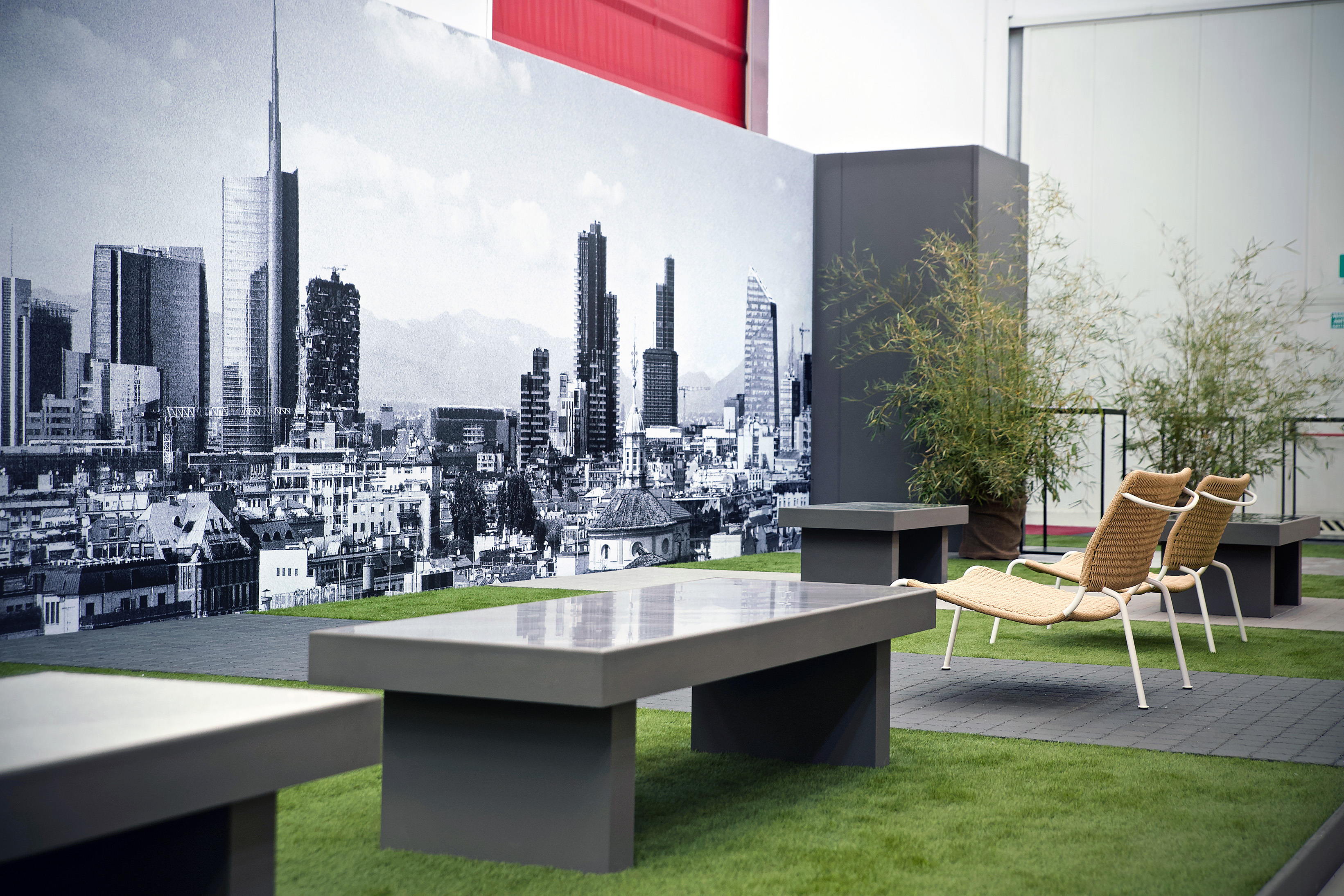
The Urban Landscape, A focus on the latest LB product, the innovative green sampietrino born from the collaboration between LB Group and Saxa Gres.


Thanks to Corrado Ravazzini for all the photographs.
Thanks to Bosa, Busnelli, Egizia, Giulio Marelli, Living Divani, Lumicom, Moma Design, Quadro Design, Re-wood, Tubes, Very Wood for furniture and accessories.
More info: www.lb-technology.it/


Carlo Bardelli


Partners news